Buttons
Buttons are interactive elements on the Adaptive Document. When a user interacts with a button on the Adaptive Document, it can trigger various events, leading to the system performing predefined actions.
At the time of writing of this article, there is only one event defined for the button - "Click". This corresponds to trigger of the event when the user clicks the button.
There can be other types of events - like "mouseover", "mouseout" etc.
Element configuration panel for a button control
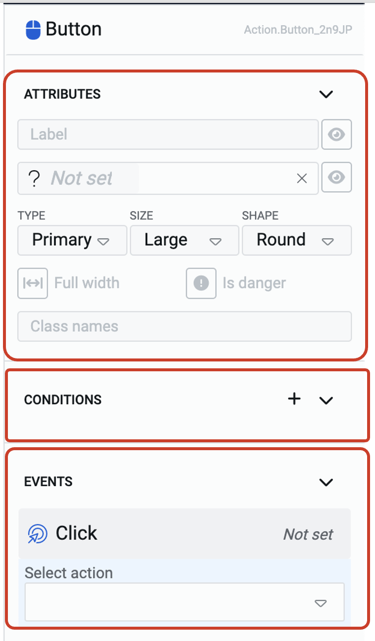
The sections available in the element configuration panel corresponds to the nature of the button control.
There are sections:
-
Attributes - to define the appearance of the button.
-
Conditions - to configure logical conditions when to show/hide, enable/disable the button.
-
Events - to define the action on the event of click of the button.
In this article, we will discuss the fields of the Attributes section and the Events section. You can learn about the Conditions section here.
Buttons do not have a validation or connections section, which is logical with the nature of the button control.
Attributes section
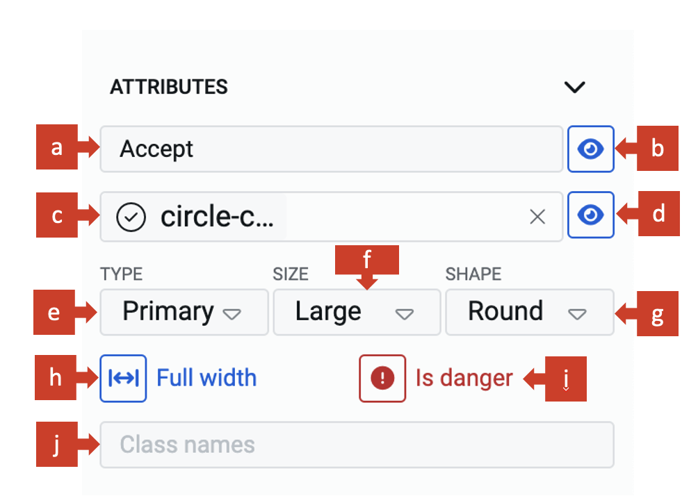
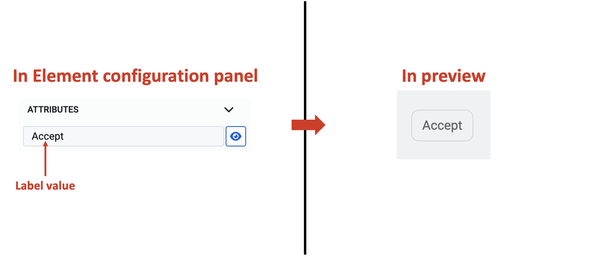
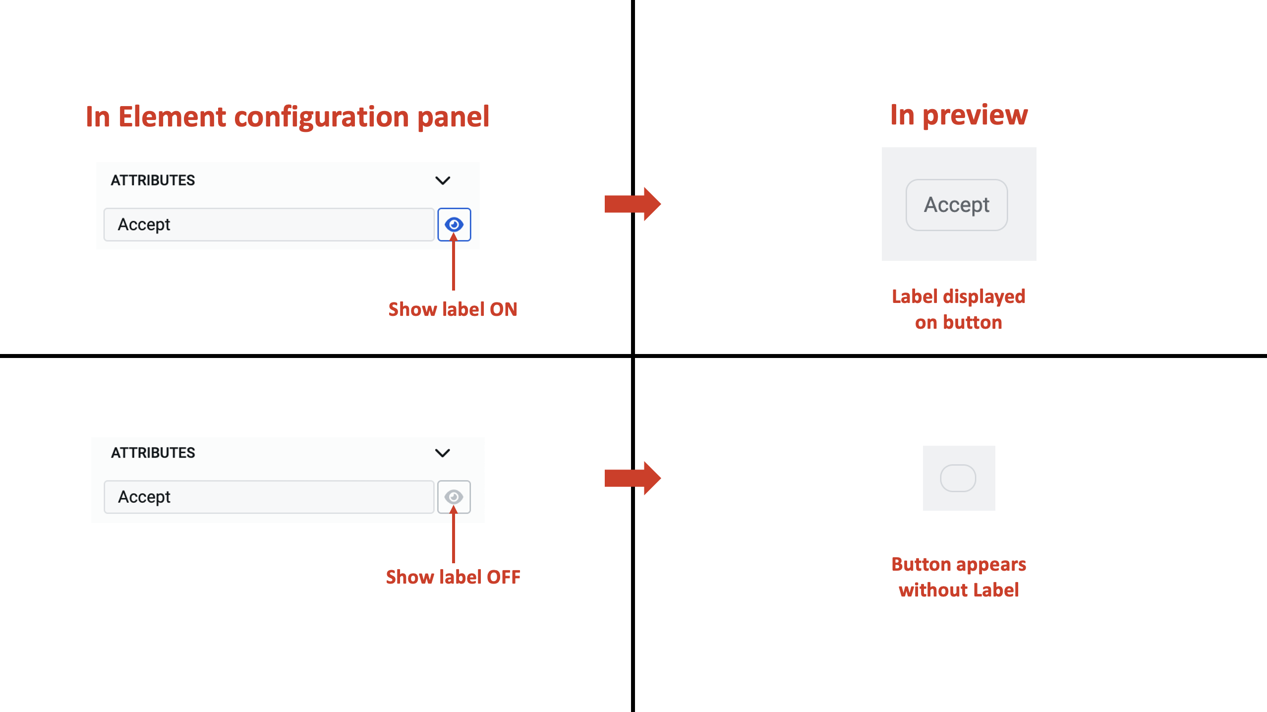
a. Label - This field allows you to type the label text, which will appear on the button.
b. Show label - When this is toggled ON, the label text will be visible on the button. When in on state the Show label icon will be displayed in blue.
c. Button icon - You can display an icon on the button.
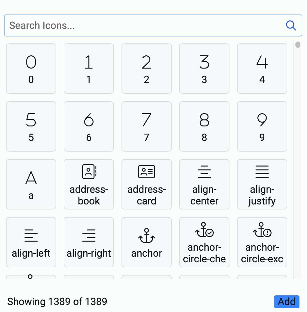
Selecting the icon for the button
- Click on this field.
- The icon picker will open. The icon picker has a list of 1389 icons.
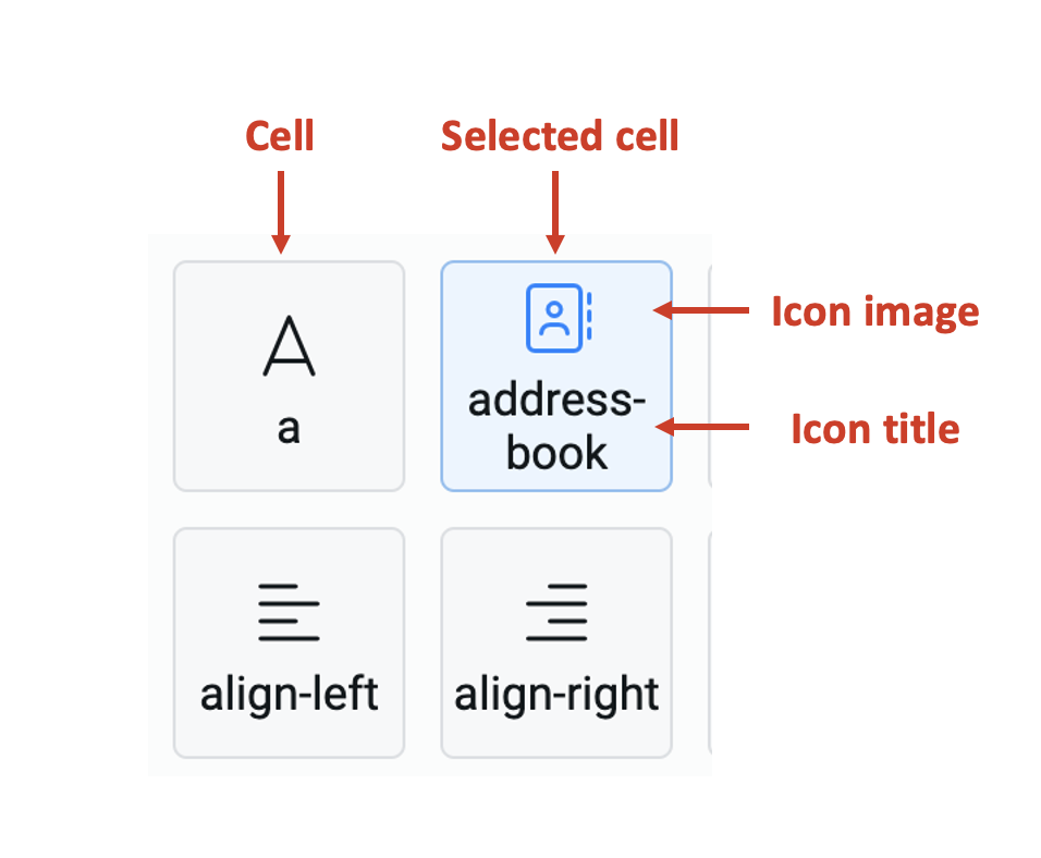
Each cell represents an icon with the icon image displayed on top and its title display below it.
-
You can search for the icon from the search icons bar. The system matches the typed keyword with the icon title and displays all the icon cells that match.
-
Select an icon by clicking on the cell. The selected cell is highlighted in blue. Please note, you can select one and only one cell.
-
Click Add at the bottom right corner of the icon picker.
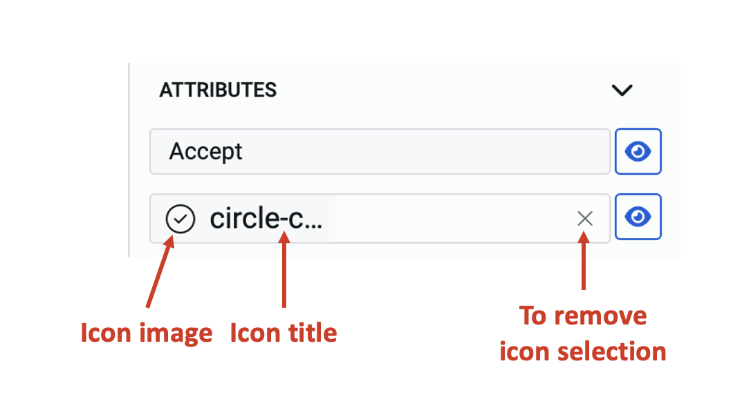
In Attributes section
The selected icon's title appears in the Button icon field.
The icon image and icon title of the selected icon are visible in the field.
You can remove the icon selection by clicking on the "X".
d. Show icon - When this is toggled ON, the icon will be visible on the button. When in ON state this will be displayed in blue.
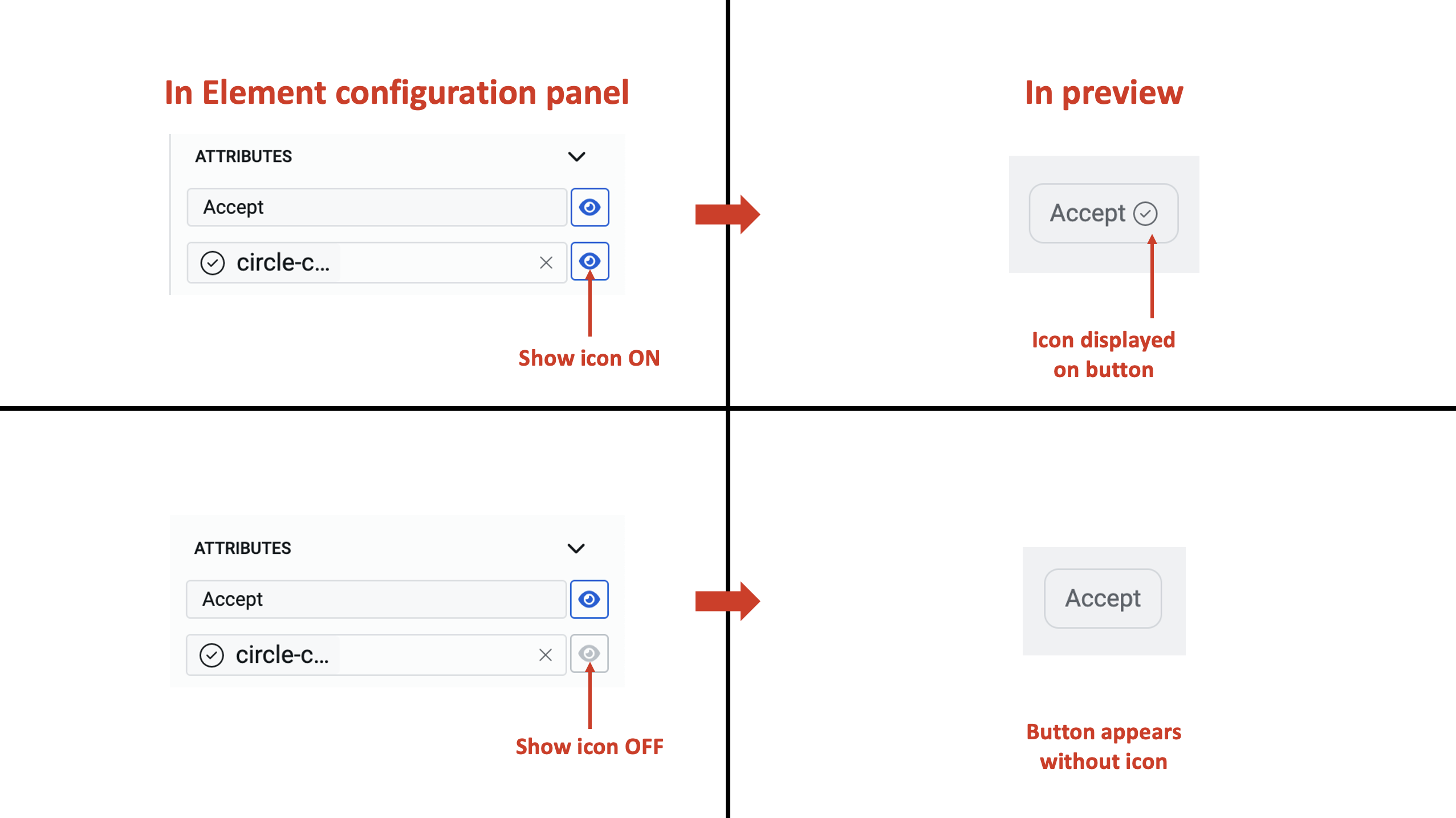
If both label and icon are shown on the button, then the icon always appears to the right of the label.
e. Type - This is a dropdown field and enables you to select the type of appearance for the button.
There are five options for the Type field:
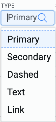
-
Primary - This type of button appears prominently with a blue background fill.
-
Secondary - This type of button appears less prominent with a grey background.
Sometimes there is a need to promote a user to click a certain button over the other(s). In such cases, the primary and secondary types of buttons are used in combination.
-
Dashed - When this type is selected, the button appears with a dashed outline.
-
Text - The button of this type appears as plain label text, without any outline.
-
Link - When this type is selected, the button appears with the label displayed as a link.
The below image shows a comparison of all the button types.

A type field is never blank. The default value when the button is added to the composition area, is Secondary.
f. Size - This is a dropdown field and enables you to select the size of the button.
There are three options for the Type field:
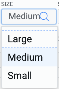
- Large
- Medium
- Small
The below image shows a comparison of all the button sizes.
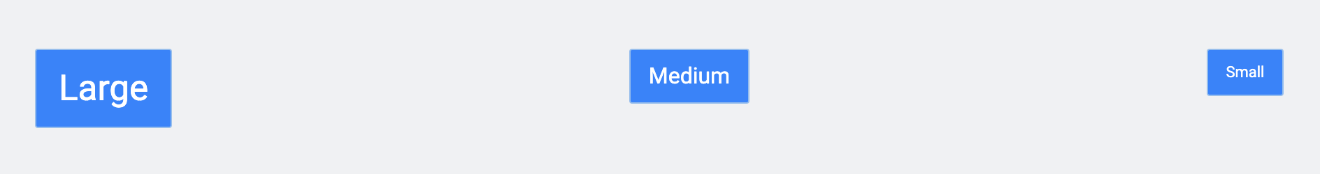
A size field is never blank. The default value when the button is added to the composition area, is Medium.
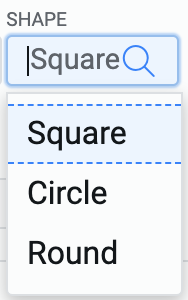
g. Shape - This is a dropdown field and enables you to select the shape of the button.
There are three options for the Type field:
- Square - this shape provides sharp edges to the button.
- Circle - this shape provides circular edges to the button, making it look like a tablet.
- Round - this shape provides rounded edges to the button, but the shape remains that of a rectangle.
The below image shows a comparison of all the button shapes.
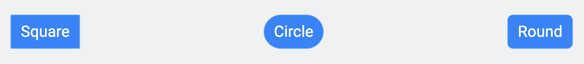
A shape field is never blank. The default value when the button is added to the composition area, is Square.
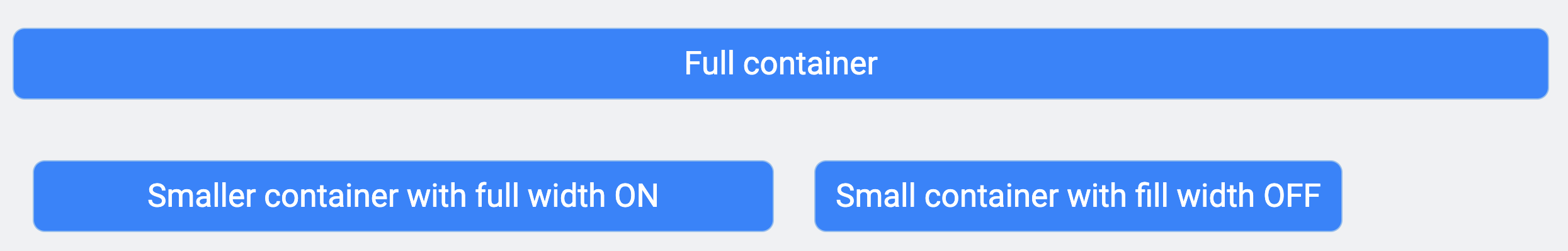
h. Full width - This field allows you to set whether the button should occupy full width of the container or not. When this if toggled ON, the full width appears in blue colour.
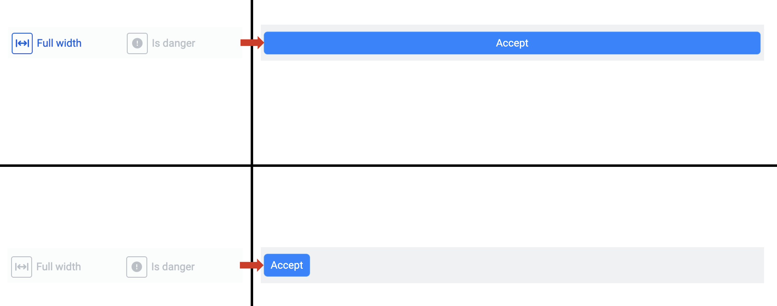
When the full width option is toggled ON, the button will expand to fill the container width-wise.
It is important to note that the container may be smaller in size, based on the layout.
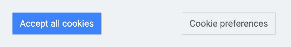
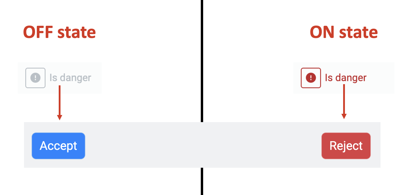
i. Is danger - This field allows you to highlight a button for user's consideration (usually a negative outcome if the button is pressed). For example - delete a file, reject terms etc.
When this field is toggled ON, it will turn the button as Red.
In the below example, Accept and Reject are labels of two different buttons. The button with label Accept has "Is danger" in OFF state and the button with label Reject has "Is danger" in ON state.
j. Class names - - In this field, you can type the name of the CSS class and the element will be styled as per the CSS class definition.
This completes our discussion on Attributes sections.
Events section
This section allows you to configure the action for an event triggered by the user. As mentioned earlier, at the time of writing this article, there is only event defined for buttons - On click event.
This section allows you to define 12 different actions when the user clicks a button.
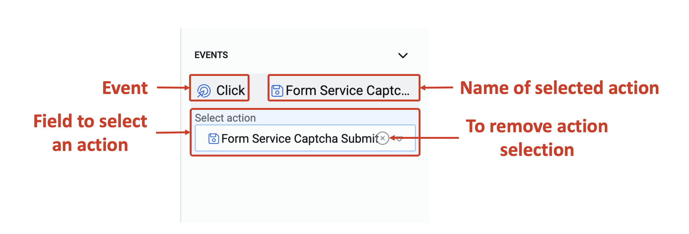
This section:
- displays the event for which an action is being configured.
- displays the name of the selected action. If no action is selected, it will display "Not set"
- provides a dropdown field to select an action for the event from a given list of 12 actions.
- ability to remove the selected action.
Defining an action for on click button event
You can select one of the 12 actions for the on-click event. Only one action can be selected. Based on the selected action, more relevant fields appear for further configuration.
Let us discuss each of these actions.
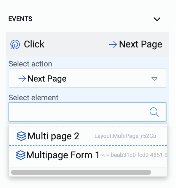
- Next Page - This is an action relevant for multi page layout. This action tells the system to go to next page (with reference to the current page) of the configured multi page layout. Therefore, if there is a multi-page layout with 5 pages, and the user is viewing page #3; then upon click of this button, the page #4 will be displayed to the user.
Configuring in Element Configuration Panel
In the Events section, as you select Next Page as the action, a new field - Select element appears. This is a dropdown field and will provide a list of titles all the multi-page layouts present in the Composition area.
You can select the relevant multi-page layout.
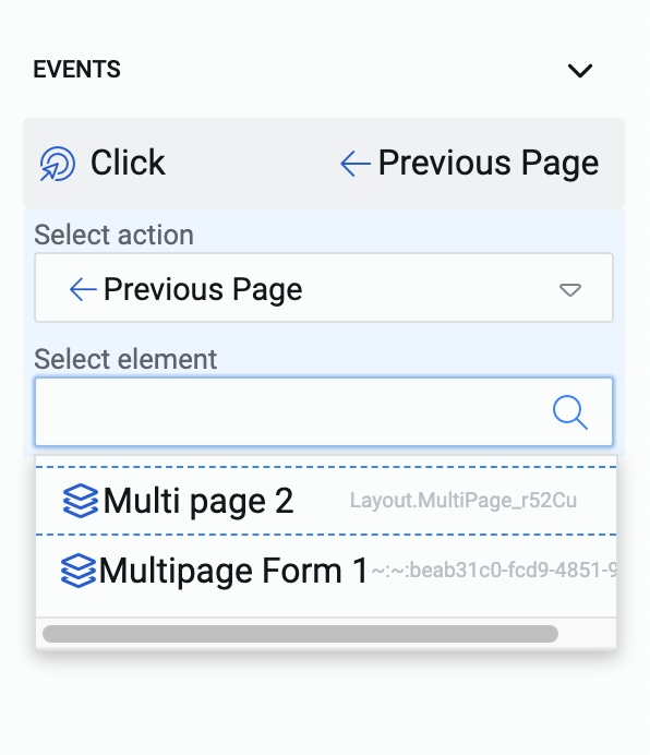
- Previous Page - Just like the Next Page action, this action enables you to define that upon click of the button, the system will show the previous page (with reference to the current page) of the configured multi page layout.
Continuing from previous example - if the user is on page #4, clicking on the button will display page #3 for the user.
Configuring in Element Configuration Panel
In the Events section, as you select Previous Page as the action, a new field - Select element appears. This is a dropdown field and will provide a list of titles of all the multi-page layouts present in the Composition area.
You can select the relevant multi-page layout.
It is not necessary to have the button inside the multi-page layout for users to control the page changes. You can place the button anywhere in the composition area and configure it to Next Page or Previous Page actions.
Further, these actions are particularly useful for multi-pages where pagination and page numbers controls are disabled.
If there are no multi-page layouts added to your document, then the actions of Next Page and Previous Page cannot be configured. The select element list will be empty in such a case.
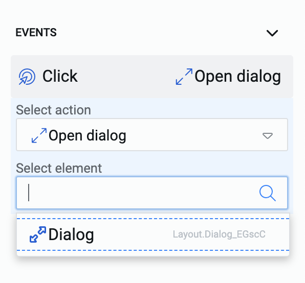
- Open dialog - Dialogs are a special type of layout that can be used to display information to the users that open like a pop-up section.
When a button is configured to Open dialog action, the system opens the dialog layout on the Adaptive Document when the user clicks the button.
Configuring in Element Configuration Panel
In the Events section, as you select Open dialog as the action, a new field - Select element appears. This is a dropdown field and will provide a list of titles of all the dialog layouts present in the Composition area.
There can be multiple dialog layouts in your document, you can select the relevant dialog layout.
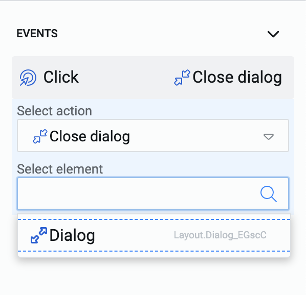
- Close dialog - Just like the Open dialog action, this action enables you to define that upon click of the button, the system will collapse the configured dialog layout.
Configuring in Element Configuration Panel
In the Events section, as you select Close dialog as the action, a new field - Select element appears. This is a dropdown field and will provide a list of titles of all the dialog layouts present in the Composition area.
You can select the relevant dialog layout.
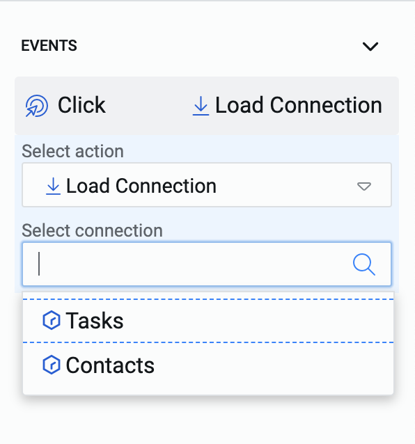
- Load Connection - This action enables the system to load all the relevant information of the connected table.
In simpler terms, this is like a pull request for the data of the connected table.
Consider the option of setting Fetch item on Load as YES while creating a connection. This "pulls" the item's data at the loading of the document. Similarly, this action "pulls" the item's data at the click of the button.
Configuring in Element Configuration Panel
In the Events section, as you select Load Connection as the action, a new field - Select connection appears. This is a dropdown field and will provide a list of all connections present in the Composition area.
You can select the relevant connection.
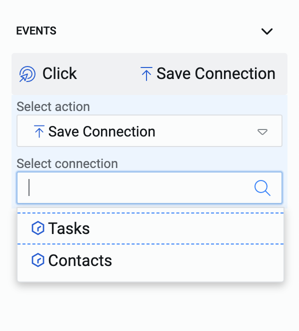
- Save Connection - Just as the Load Connection action pulls the data from the table connection, Save Connection action pushes the document data to the table connection.
Configuring in Element Configuration Panel
In the Events section, as you select Save Connection as the action, a new field - Select connection appears. This is a dropdown field and will provide a list of all connections present in the Composition area.
You can select the relevant connection.
- Add Repeat - This action enables the user to repeat a section with a defined set of controls. With one click, the section is repeated once. To have this button perform meaningfully, you must have added the repeating section using the Element picker.
Configuring in Element Configuration Panel
In the Events section, as you select Add Repeat as the action, a new field - Select element appears. This is a dropdown field and will provide a list of all sections that are repeating in nature in the Composition area.
You can select the relevant repeating section.
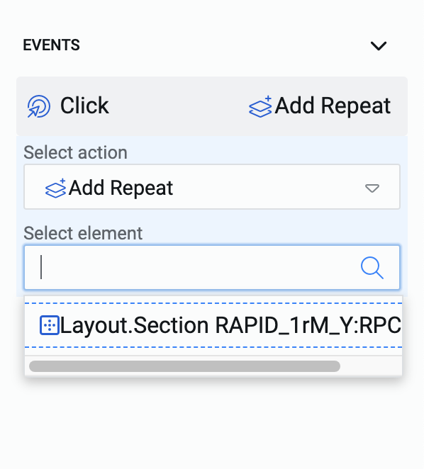
The Add Repeat button can be placed outside the repeating section and each click by the user will result in addition of one iteration of the section.
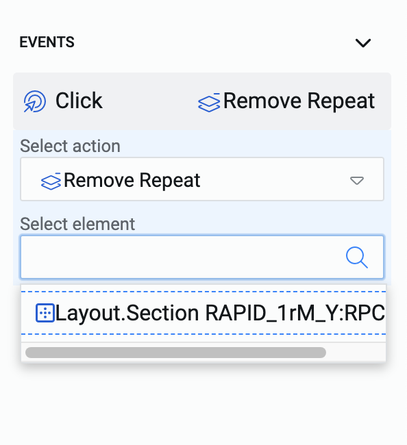
- Remove Repeat - Imagine a user has added an iteration to the repeat section by mistake OR the user has added five iterations to the repeat section and wants to remove the second one. In such cases, the user needs to remove an iteration from the repeating section.
The Remove Repeat action enables the user to remove an iteration from the repeating section.
While the Add Repeat button can be placed anywhere in the document, it is necessary to place the Remove Repeat button within the repeating section. The Remove Repeat button gets dedicated to each iteration of the repeating section.
This is logical because, an Add Repeat button adds a blank iteration of repeating section, however, a Remove Repeat button can help remove a specific iteration from the stack created. For example - remove second iteration from the ten added.
To have this button perform meaningfully, you must have added the repeating section using the Element picker and placed the subject button in the repeating section.
Configuring in Element Configuration Panel
In the Events section, as you select Remove Repeat as the action, a new field - Select element appears. This is a dropdown field and will provide a list of all sections that are repeating in nature in the Composition area.
You can select the relevant repeating section.
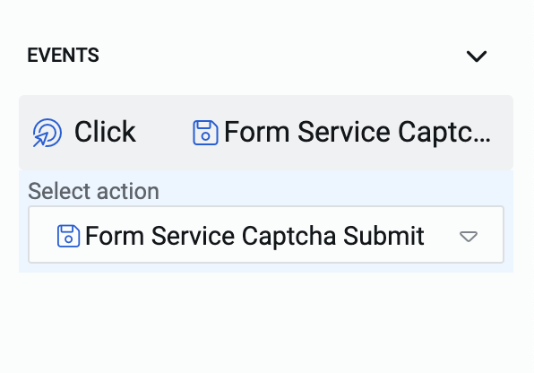
- Form Service Captcha Submit - In a typical use case, an Adaptive Document form contains input fields where the user enters information. When the 'Submit' button is pressed, this information is sent to the system for processing.
When the Submit action submits the data of all the input fields and it can never be a partial submit.
Once the form is submitted, the values entered byt the user cannot be changed. These will be processed by the system.
Configuring in Element Configuration Panel
In the Events section, you need to select Form Service Captcha Submit as the action.
Upon selection of this action, there are no additional fields which appear, as no sections or elements are required to be selected. The submit button will submit the entire form.
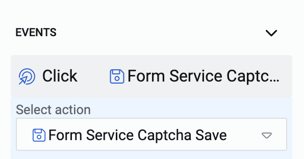
- Form Service Captcha Save - Not all Adaptive Document Forms can be completed in one sitting. Some forms may be too lengthy or contain fields that require users to consult other resources. In such cases, users may need the ability to partially fill out the form and return to it later.
This feature is provided by the Save action. If you have configured this action on the button, the user can fill-out a form partially and click this button. It will save the values filled by the user (not submit the form). The user can return to it and make changes to the previously entered values and/or add new values to complete the form.
Configuring in Element Configuration Panel
In the Events section, you need to select Form Service Captcha Save as the action.
Upon selection of this action, there are no additional fields which appear, as no sections or elements are required to be selected. The save button will save the entire form.
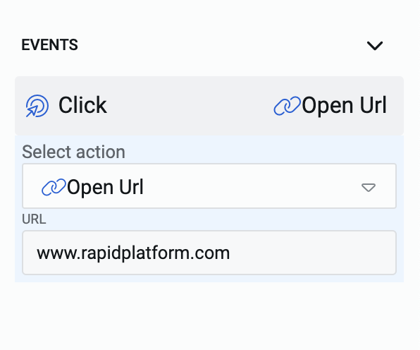
- Open Url - You can configure buttons to open a Url on a new tab. This can be done by configuring the "Open Url" action on the button.
An open Url action is often used with a "Link" type of button (defined earlier in this article).
Configuring in Element Configuration Panel
In the Events section, as you select Open Url as the action, a new field - URL appears. Type in the desired URL here. When the user clicks this button, the configured Url will open in a new tab of the browser.
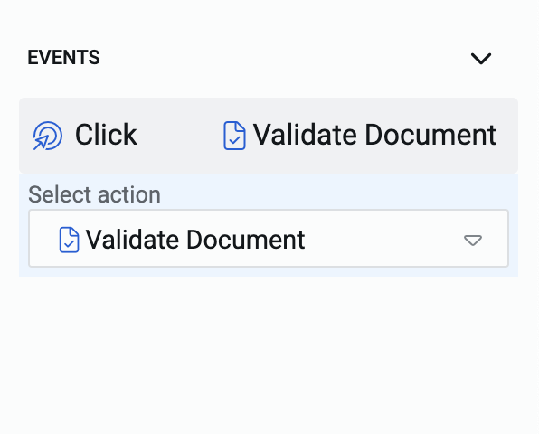
- Validate Document - There may be a situation, where the user wants to validate his/her input data before submitting. The validation of an Adaptive Document triggers at the time of submission. However, typically in larger forms, users may want to validate them before submission, when they are not sure of the information being entered.
You can provide the users with this feature by configuring the button as Validate Document. When the user clicks this button, it will trigger the Validation check set at the document level.
Configuring in Element Configuration Panel
In the Events section, you need to select Validate Document as the action.
Upon selection of this action, there are no additional fields which appear, as no sections or elements are required to be selected. The validate document button will trigger the validation check for the entire form.