Choice
What is a Choice input control?
A choice control allows the user of the Adaptive Document to select an input from a defined set of options.
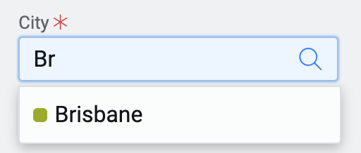
For example: Imagine you are creating a form for users to fill in their personal information. You want to provide an input control where the users provide their city of residence. In such a case, to make it easier for the users to input their city, you can provide the list of cities in Australia. The user can easily select the relevant one from the list.
How does the Element Configuration Panel for Choice control appear?
The Element configuration panel for the Choice control appears as shown in the below image:
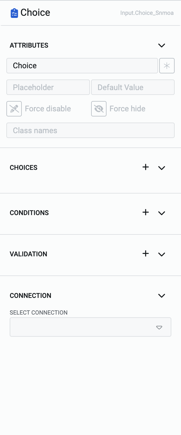
The panel has five categories:
- Attributes - To define the appearance of the Choice element.
- Choices - To define the options that appear in the Choice element.
- Conditions - To define the conditions when the Choice element be enabled/disabled and/or shown/hidden.
- Validation - To define the validation rule for the Choice element.
- Connection - To establish connection of the Choice element with a table column.
In this article, we shall discuss about Attributes and Choices configuration categories only.
Attributes category
Consider the following image and corresponding list sequentially explaining the fields of the attributes section for Choice control.
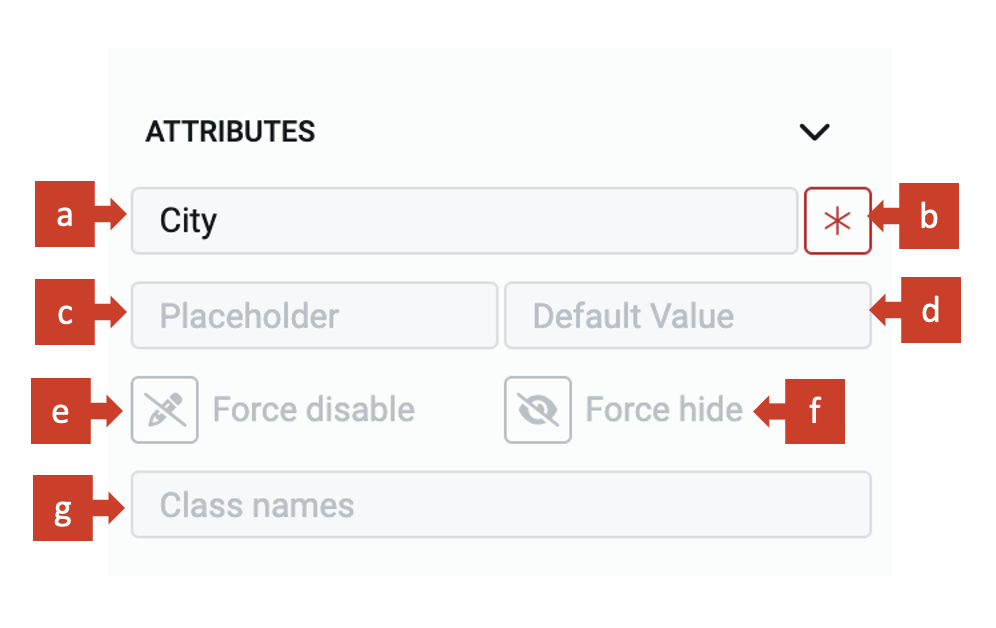
a. Label - This field allows you to type the label to the Choice control. The label shall appear above the element in the Adaptive Document and is used to provide context for the user.
b. Asterisk (*) sign - If you click ON this field, then an asterisk sign will appear next to the label. This is used to indicate a special message to the users of the document. For example - conditions apply, the element is mandatory etc.
It is important to note that the Asterisk sign is only a visual indicator and does not imply any logical condition on the control. For example - turning the Asterisk sign as ON will not make the Choice control a mandatory element for users. All logical behaviour for the control should be configured using conditions and validations.
c. Placeholder - The text entered in this field will appear in the Choice element as ghosted text. You can use this Placeholder field to provide short instruction to the users, about the information they need to input in the element.
The Placeholder text is only for display purposes. The text filled in the Placeholder is visible to the user only till the time, the user has not selected the element for typing value OR there is no default value selected for the element.
If the user leaves the element blank and submits the document, then the element will NOT submit the Placeholder value and the blank value is submitted for the element.
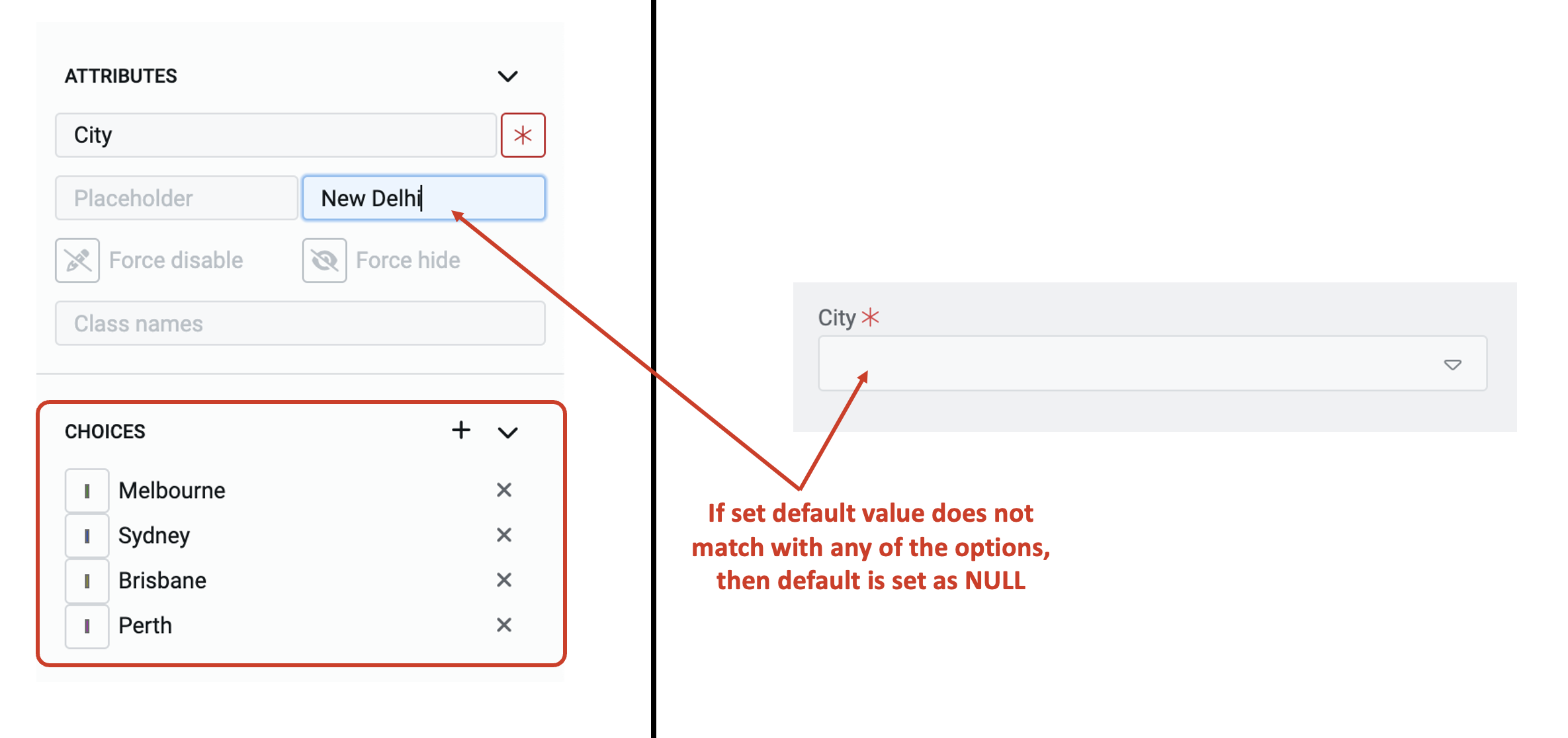
d. Default value - The text typed in this field becomes the default value for the element. If the user selects a different value to the element, then the default value will be replaced by the user selected value. If the user does not alter the value of the element and submits the document, then the default value will be submitted as element value.
A default value may be useful when you feel most users will select the same value, however, you still want to give them a flexibility to change the value of the element. For example - you are seeking user's contact information. You can set the city's default value as Brisbane, as you believe most users would select this option, however, the users can overwrite the default value by selecting say, Sydney.
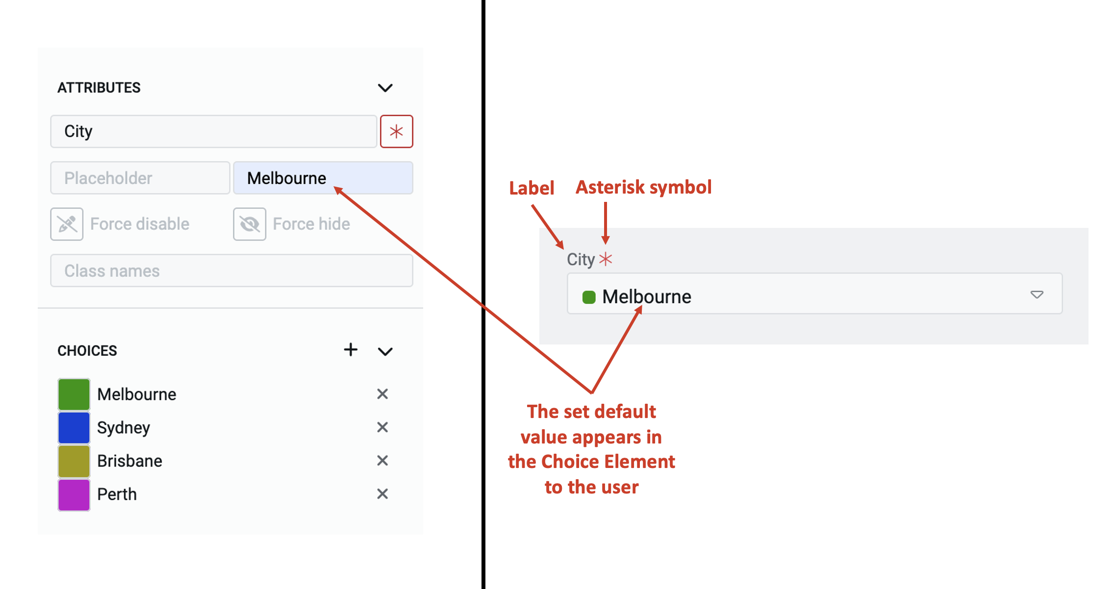
The default value that you type in the field will be effective only if it matches with one of the defined choices for the element.
In case, the typed value does not match any of the defined choice values, then the default value will be taken as NULL.
e. Force disable - If this field is clicked ON, then it will supersede all enable conditions and the element will always remain in disabled mode.
This is useful when you want to display a dynamic piece of information to the users. For example - Imagine a form to book tickets for a Cricket match in a series that is hosted at different venues in Australia. As soon as user selects which match tickets they want to book, the venue is pre-populated. In such cases, while the venue details are a useful piece of information, you do not want the users to change the same. Hence the element will display the value, but will remain disabled for user selection.
f. Force hide - If this field is clicked ON, then it will supersede all show conditions and the element will always remain hidden from the user.
This feature can be used in advanced Adaptive Documents, where you need to pass a certain value, like a status of lead or an employee job band, but do not want to show it to the user. The element will remain hidden from the user, and hence the user would not be able to view or select any value to the element.
i. Class names - In this field, you can type the name of the CSS class and the element will be styled as per the CSS class definition.
Choices category
This category houses all the options which the choice element will display to a user in the dropdown.
When creating the options for the first time for the element, the category will appear as shown below:
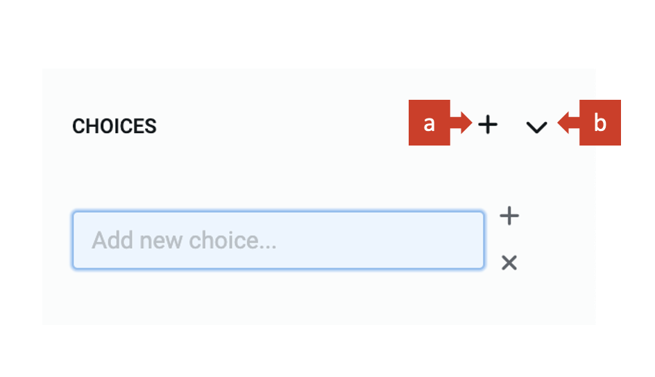
It has two buttons:
a. "+" - Clicking on this open the field to define a new option for the choice element.
b. ">" - This button toggles the open/collapse choices category.
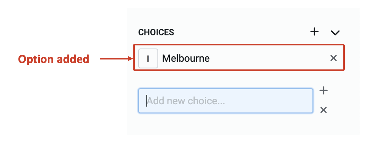
Adding new choices
To add new choices to the element, consider the following steps:
-
Click on "+". The "Add new choice" field will appear.
-
Type the text for the option title.
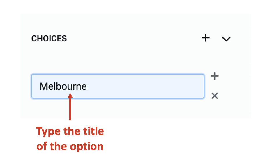
- Press enter. The entered text will now become a choice option.
Updating existing choices
You can perform the following update actions on the choice:
a. Set / change the colour of the option:
To open colour setting panel, click on the icon left to the option text.
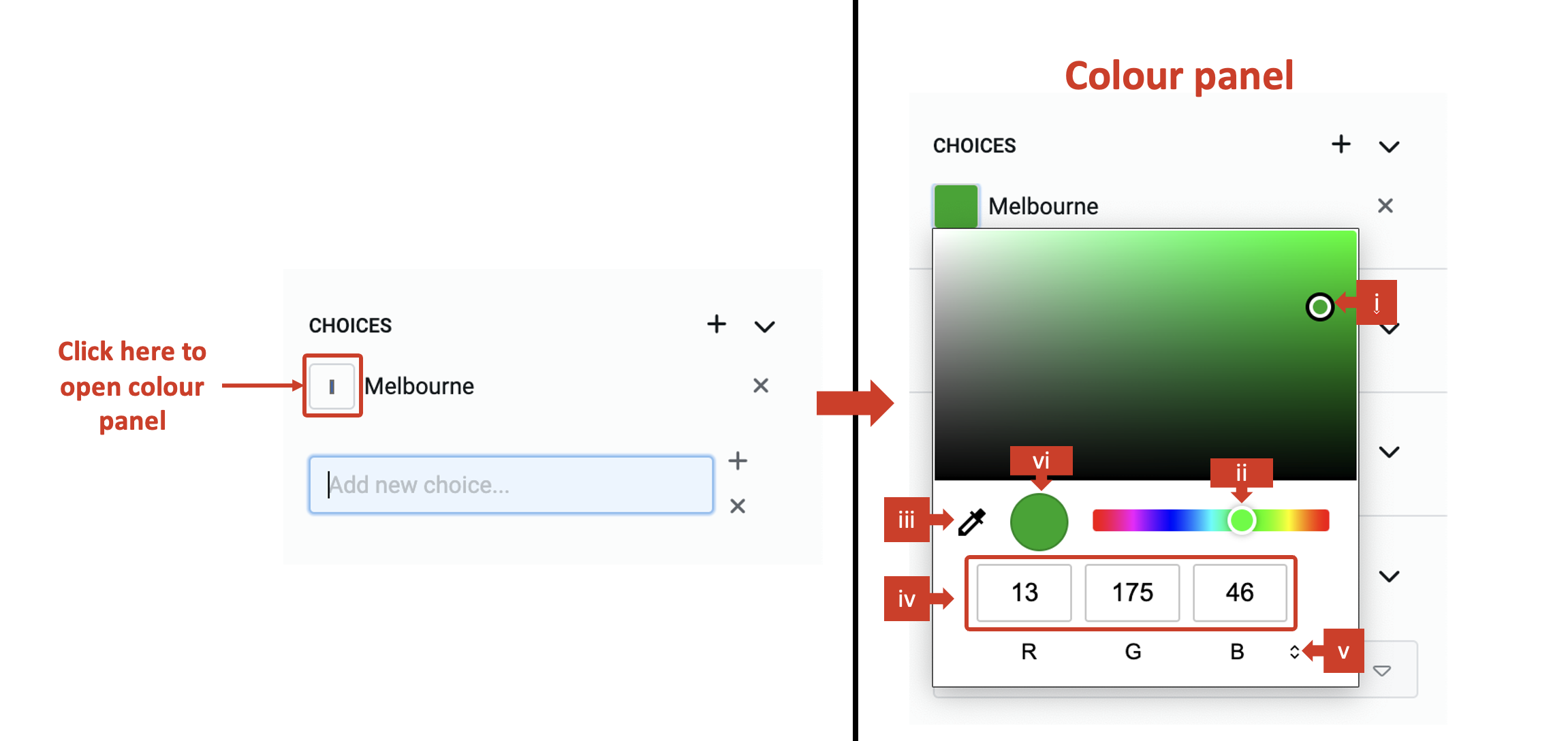
You will receive the following options to set colour for the option.
i. Drag the point on the color shade. ii. Drag the point to change the colour over the spectrum. iii. Click on the dropper to copy colour settings from other image point visible on the screen. iv. Set code for colour definition method (for example - set code for R, G and B). v. Change the colour definition method. There are three options available - RGB, HSL and Hex.
vi. The defined colour is visible in the circle.
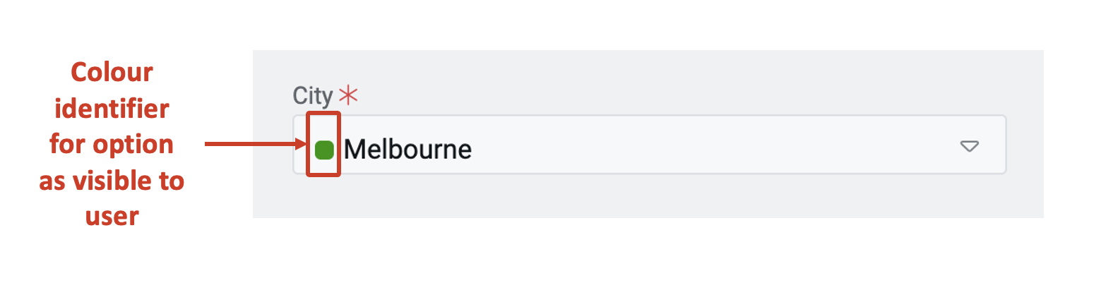
Once you set the colour of the option, it appears next to the option and assists in visual recognition of the choice.
b. Update the option text
Double click on the option text and it will become editable.
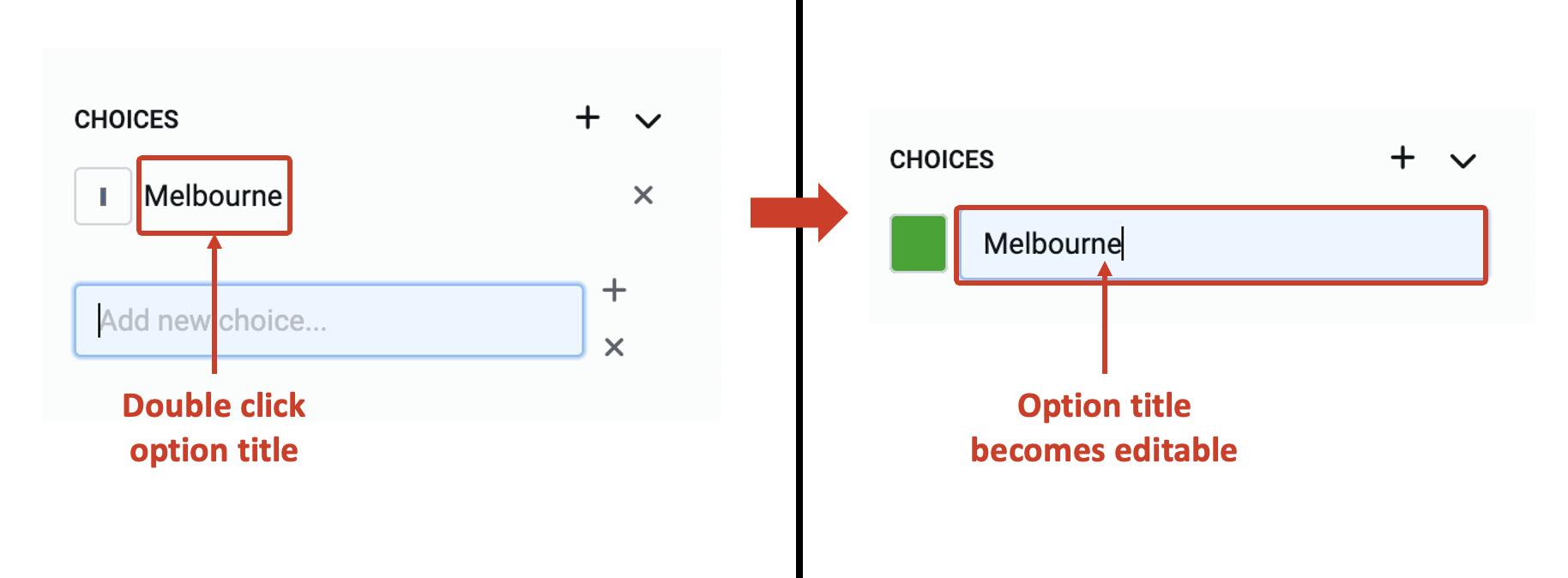
Update the text and press enter. The option text will be updated.
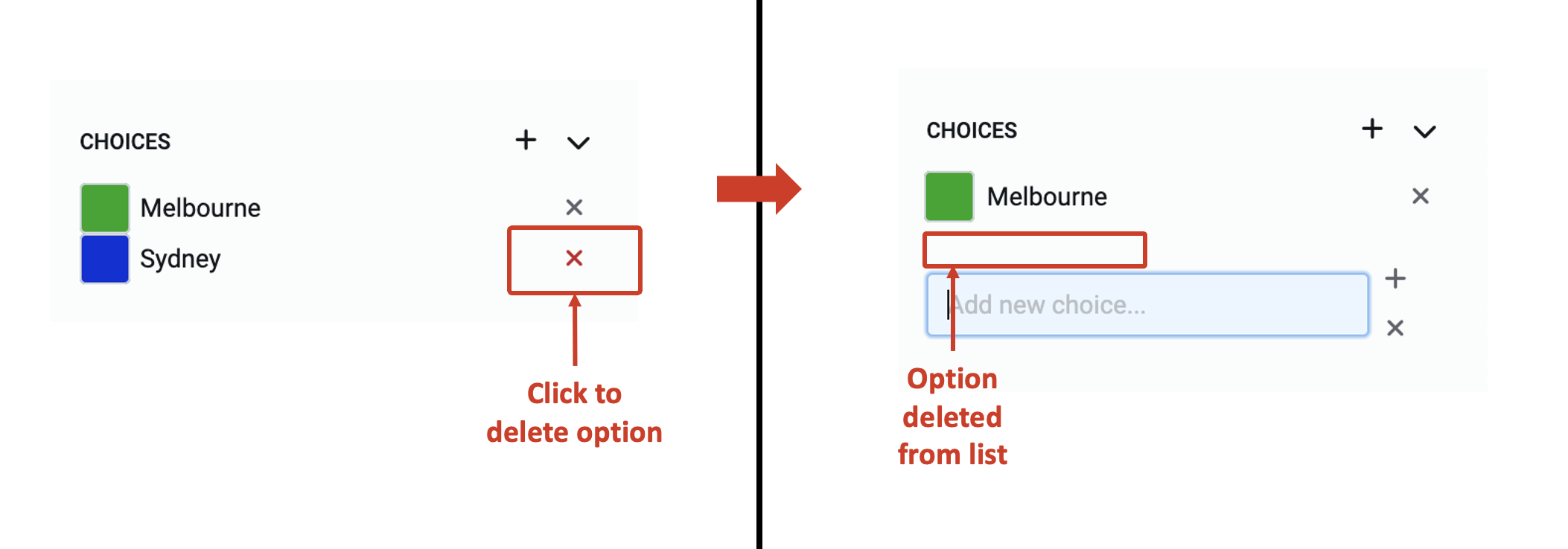
c. Delete an option
Click on the X icon and the option will be deleted from the list.
Features available to user
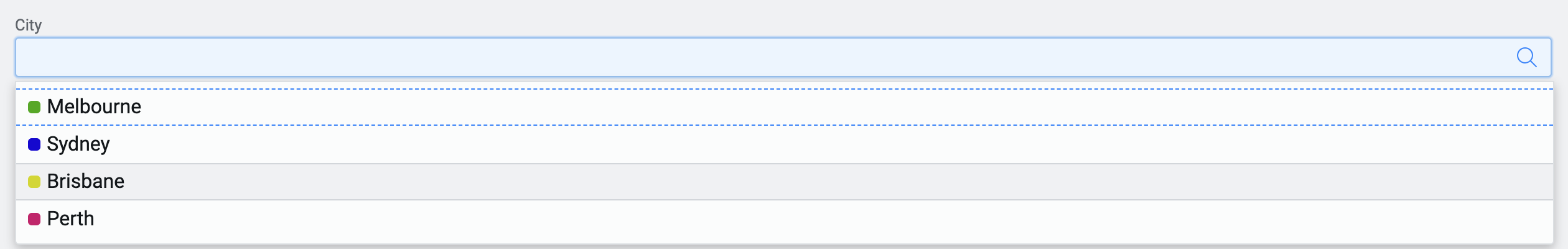
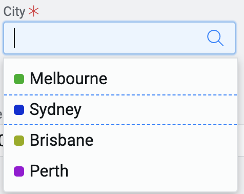
The below image shows how the choice element appears to a user. The option under focus appears between two blue dashed lines.
-
As the user click on the choice element, the dropdown opens showing the list of all available options.
-
The user can select an option by clicking on it.
-
The user can use arrow keys to scroll through the list and then press enter to select the option
-
The user can type text in the choice element, and the list will prune to match the entered text.