Percentage
What is a Percentage input control?
A percentage control allows the user of the Adaptive Document to enter a number in percentage form.
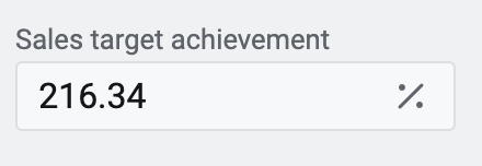
For example: Imagine a project manager and entering the data on completed tasks as a percentage of total project tasks. OR a finance manager entering project expenses as a percentage of budgeted funds. OR a sales manager reporting on sales achieved as a percentage of sales targets.
In such cases, the simple number input control does not suffice for the requirement. The user requires a percentage input control.
The percentage control serves the specific requirement for entering a number in percentage form. It provides context to the input as the number can now be represented as a percentage of another parameter.
Although mathematically a percentage can be depicted as a decimal number, it is important from a presentation and business context perspective to represent it explicitly as a percentage rather than as a simple number.
Mathematically 27.34% can be represented as a number 0.2734. However, it is meaningful when we 27.34% of budget was spent on marketing; rather than saying 0.2734 of budget was spent on marketing.
The percentage control is built over the Number control. This article will discuss only the aspects that are different from the Number control.
Hence, to gain a comprehensive understanding of percentage control, it is recommended that you refer the article on Number control .
What are the attributes for Percentage control?
Consider the following image depicting the fields of the attributes section for percentage control. Please note, there is only one field which is different from the Number control attributes. We shall discuss the same here.
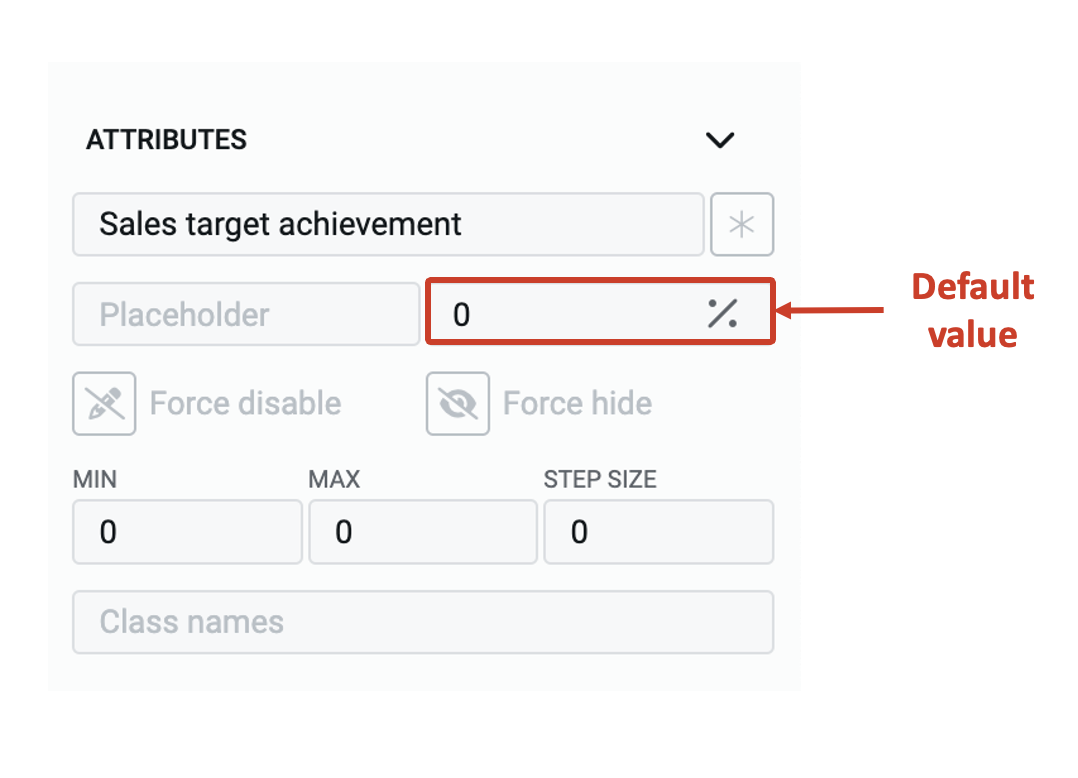
Default value - The number typed in this field becomes the default value for the element. If the user inputs a value to the element, then the default value will be replaced by the user entered value. If the user leaves the element blank, then the default value will be submitted as element value.
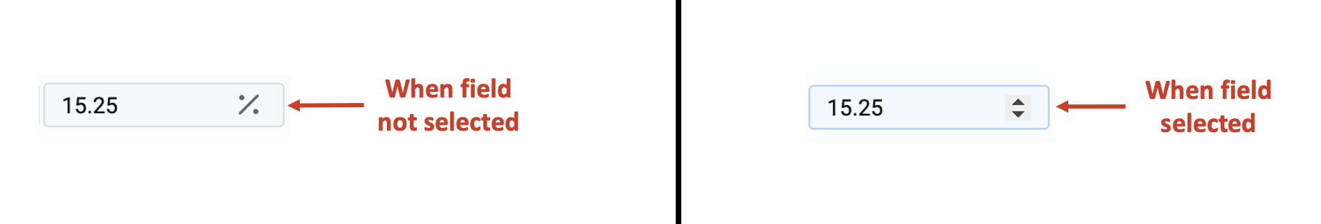
The default value field shows a percentage sign on it. However, as you hover the mouse pointer over the field, the % (percentage) sign will be replaced with the increment / decrement button. As you hover the pointer away from the field, the % sign will reappear.
If you click and select the default value field, then the increment / decrement buttons will appear and wont go away as long as the field is selected.
As indicated earlier, the rest of the behaviour of percentage control is identical to the Number control. Please visit the same for detailed explanation of each of the attributes.