Single line
What is a Single line input control?
A single line control, in its most fundamental form, allows the user of the Adaptive Document to enter a single line of text.
For example: Imagine you are creating a form which the users can use to fill in their personal information. You want to provide an input control where the users can fill in the First Name.

What are the attributes for Single line?
Consider the following image and corresponding list sequentially explaining the fields of the attributes section for Single line control.
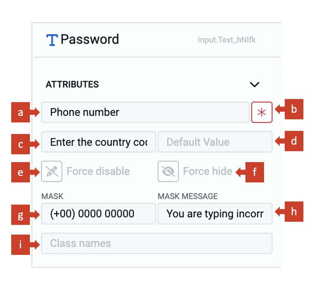
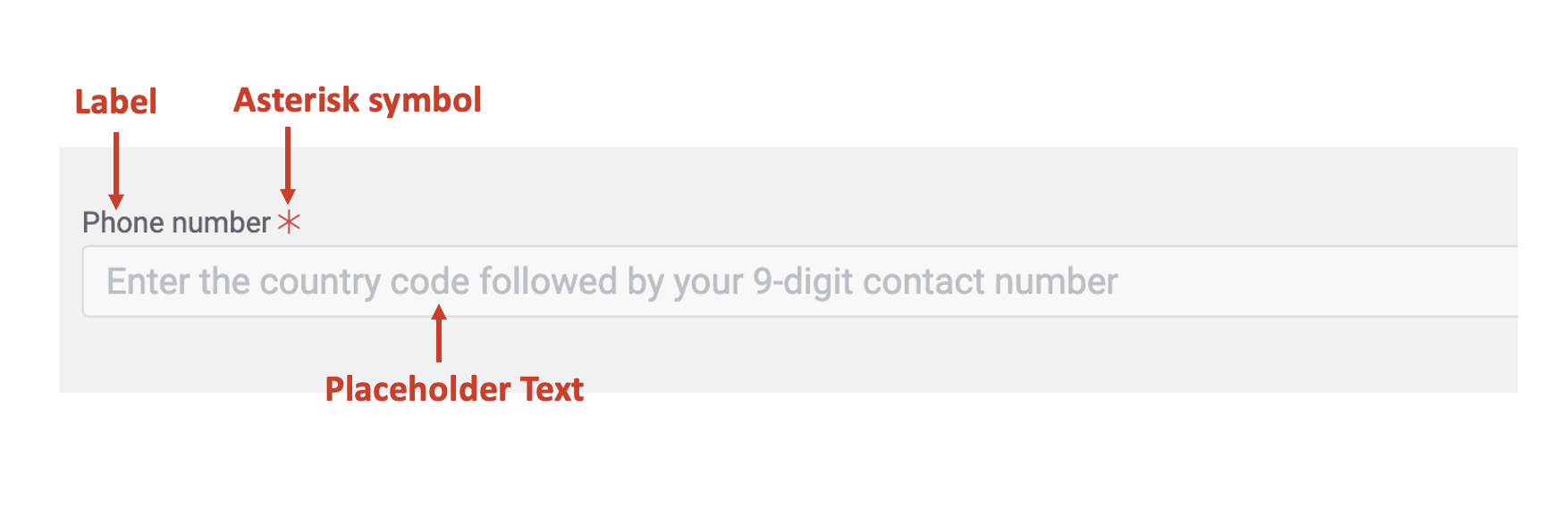
a. Label - This field allows you to type the label to the single line control. The label shall appear above the element in the Adaptive Document and is used to provide context for the user.
b. Asterisk (*) sign - If you click ON this field, then an asterisk sign will appear next to the label. This is used to indicate a special message to the users of the document. For example - conditions apply, the element is mandatory etc.
It is important to note that the Asterisk sign is only a visual indicator and does not imply any logical condition on the control. For example - turning the Asterisk sign as ON will not make the Single line control a mandatory element for users. All logical behaviour for the control should be configured using conditions and validations.
c. Placeholder - The text entered in this field will appear in the Single line element as ghosted text. You can use this Placeholder field to provide short instruction to the users, about the information they need to fill in the element.
The Placeholder text is only for display purposes. The text filled in the Placeholder is visible to the user only till the time, the user has not selected the element for typing value. If the user leaves the element blank, then the element will NOT have the Placeholder value and the blank value submitted for the element.
d. Default value - The text typed in this field becomes the default value for the element. If the user inputs a value to the element, then the default value will be replaced by the user entered value. If the user leaves the element blank, then the default value will be submitted as element value.
A default value may be useful when you feel most users will fill out the same value, however, you still want to give them a flexibility to change the value of the element. For example - you are seeking user's contact information. The country field is a single line element. You may set the default value as Australia.
e. Force disable - If this field is clicked ON, then it will supersede all enable conditions and the element will always remain in disabled mode.
This is useful when you want to display a dynamic piece of information to the users. For example - Ticket reference number etc. In such cases, while the ticket reference number is a useful information, you do not want the users to change the same. Hence the element will display the value, but will remain disabled for user input.
f. Force hide - If this field is clicked ON, then it will supersede all show conditions and the element will always remain hidden from the user.
This feature can be used in advanced Adaptive Documents, where you need to pass a certain value, an ID or a reference number to the information record, but do not want to show it to the user. The element will remain hidden from the user, and hence the user would not be able to enter any value to the element.
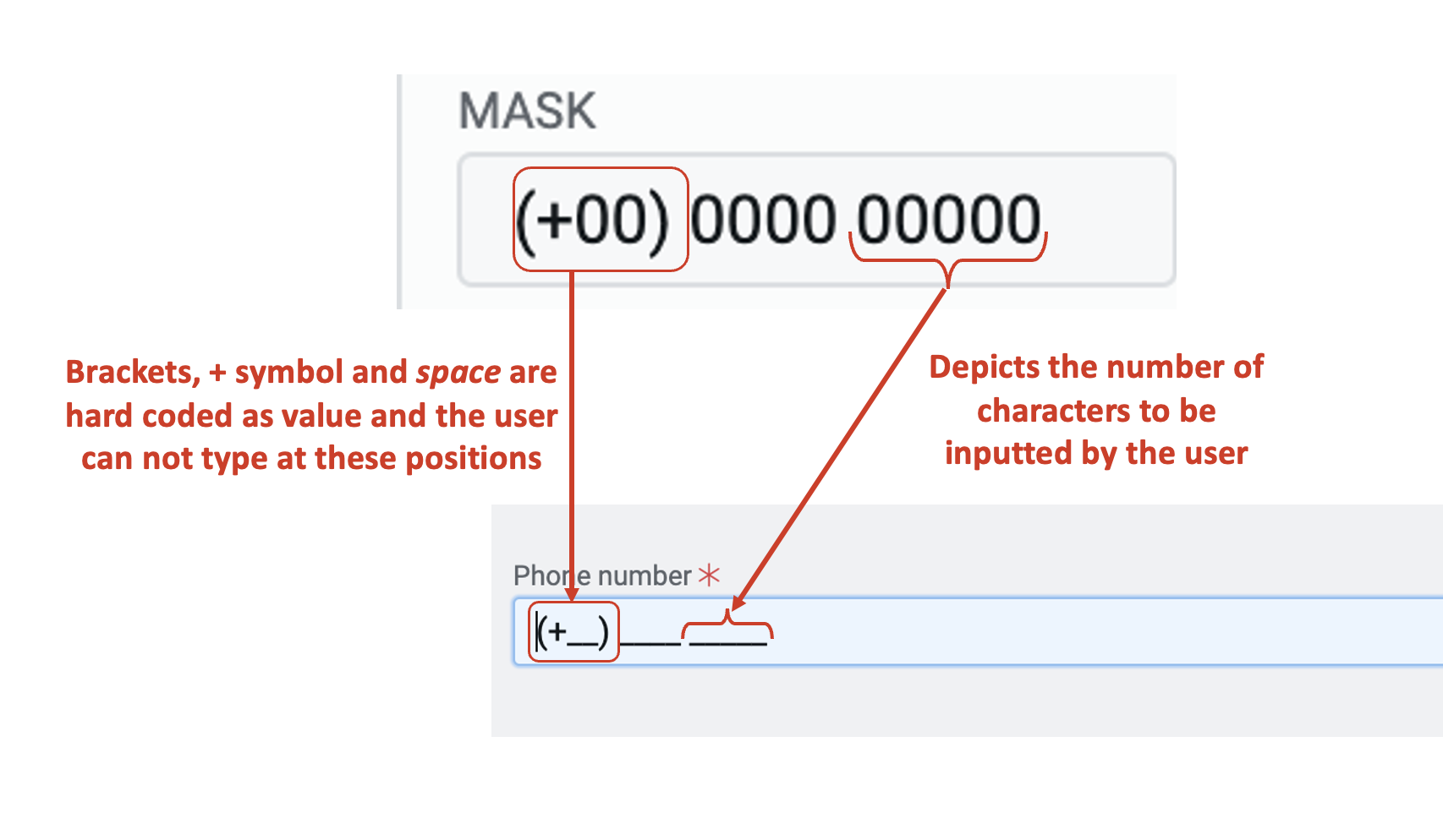
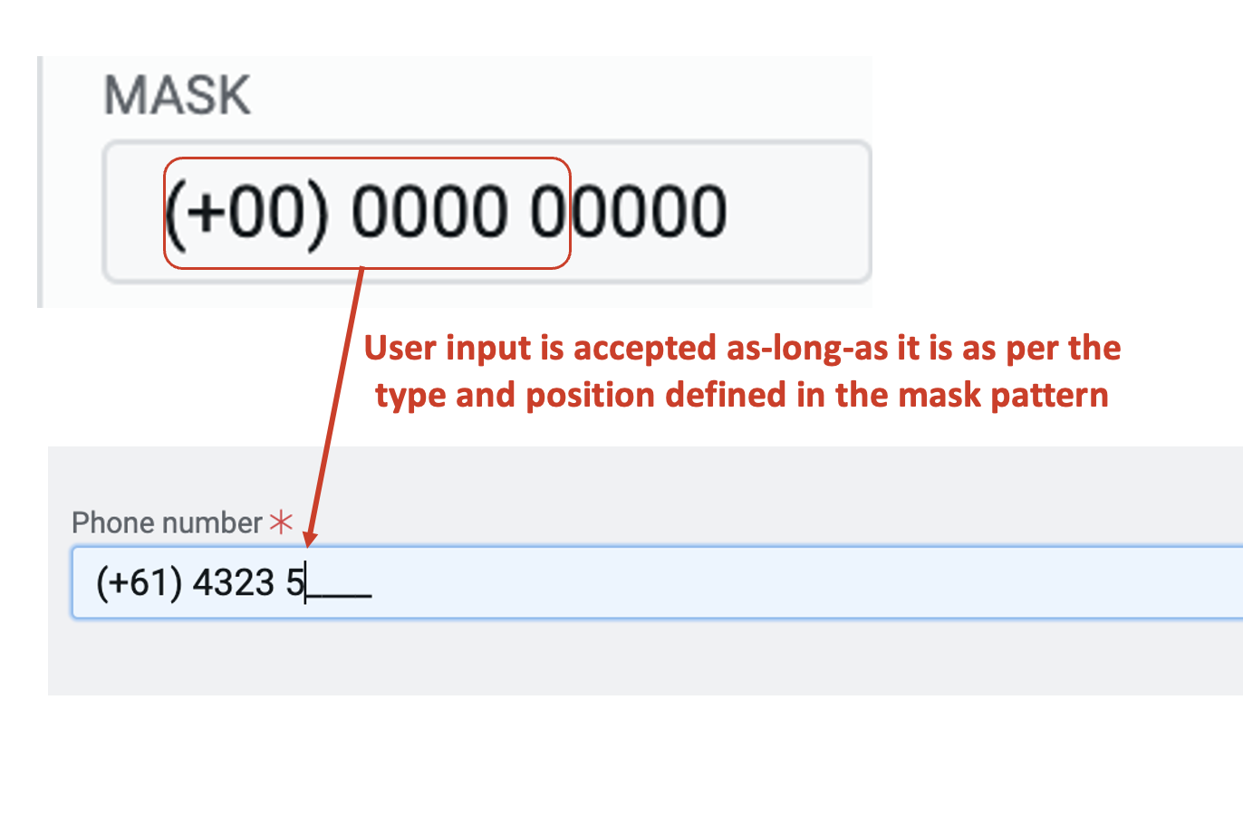
g. Mask - The mask field enables you to define a specific pattern for the user to enter the value.
For example - imagine you want to capture the user's contact number. You want to restrict the user from entering any alphabets to the element (either intentionally or as a typo-error).
In such cases, you can define the pattern code in this field. You can only some specific symbols in the Mask field.
Following are the symbols you can enter, along with their meaning:
x or X - for alphanumeric input (a to z, A to Z and 0 to 9).
0 - for numerical input (0 to 9).
() - circular brackets
"+" - symbol.
Space can also be inserted in the pattern.
The (), + symbol and space will be entered to the value at their defined position. The user does not need to type them AND will not be able to remove them or change their position while entering the value to the element.
If the mask is defined, the element will appear to hold "___" blanks indicating to the user the number of characters that need to be inputted in the element.
If a mask is defined, the user can enter the value in the defined pattern only. One cannot alter the position. For example - if the defined mask is x0 - the user can enter "a9" but not "9a" as a value. Hence, both acceptable the type of character and position of character both are defined by the Mask.
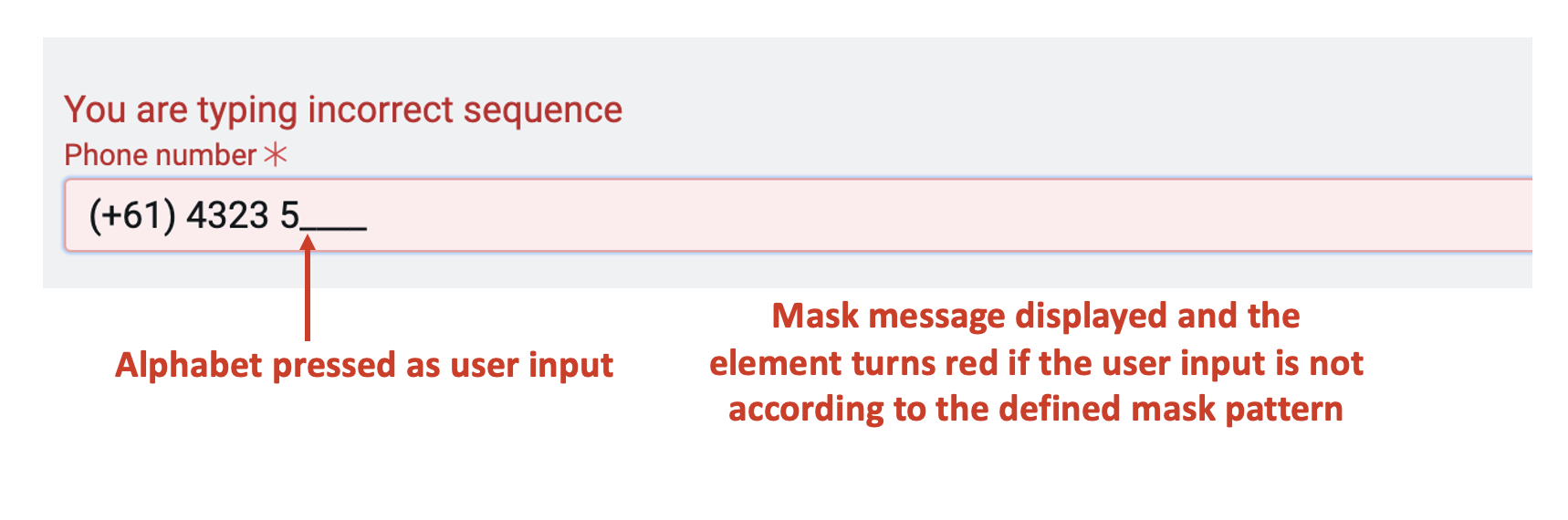
h. Mask message - This field allows you to enter the text, which will be displayed to the user when a character inconsistent to the defined mask pattern is entered.
For example - if an alphabet is pressed where the mask requires a numerical input.
If a mask is defined and it is not filled properly, then it will not allow the user to submit the Adaptive Document.
However, one may leave the element blank and submit, if it not configured as mandatory to be filled.
i. Class names - In this field, you can type the name of the CSS class and the element will be styled as per the CSS class definition.