Toggle
What is a Toggle input control?
A toggle input (also known as the boolean input) is a type of input control that allows users to select between two mutually exclusive states, typically represented as "Yes/No," "On/Off," or "True/False." This type of input is used to capture a simple binary decision or preference from the user.
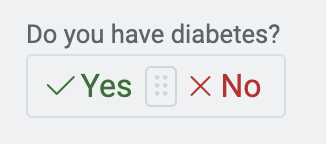
For example: Imagine you are creating a form which the users can use to fill in their medical history information. You want to provide a control where the users can input whether they have diabetes or not.
What are the attributes for toggle control?
Consider the following image and corresponding list sequentially explaining the fields of the attributes section for toggle control.
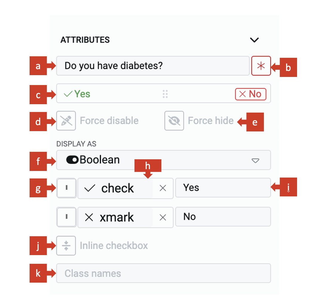
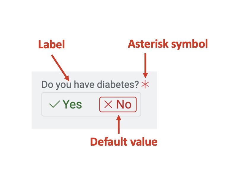
a. Label - This field allows you to type the label to the toggle control. The label shall appear above the element in the Adaptive Document and is used to provide context for the user.
b. Asterisk (*) sign - If you click ON this field, then an asterisk sign will appear next to the label. This is used to indicate a special message to the users of the document. For example - conditions apply, the element is mandatory etc.
It is important to note that the Asterisk sign is only a visual indicator and does not imply any logical condition on the control. For example - turning the Asterisk sign as ON will not make the toggle control a mandatory element for users. All logical behaviour for the control should be configured using conditions and validations.
c. Default value - You can set the default value for the toggle element here. If the user inputs a value to the element, then the default value will be replaced by the user entered value. If the user does not interact with the element, then the default value will be submitted as element value.
The toggle control has three options available to be set as default value. This makes it a tri-state boolean. The three values are:
Yes - Value 1
Not sure - Value 2
No - Value 3
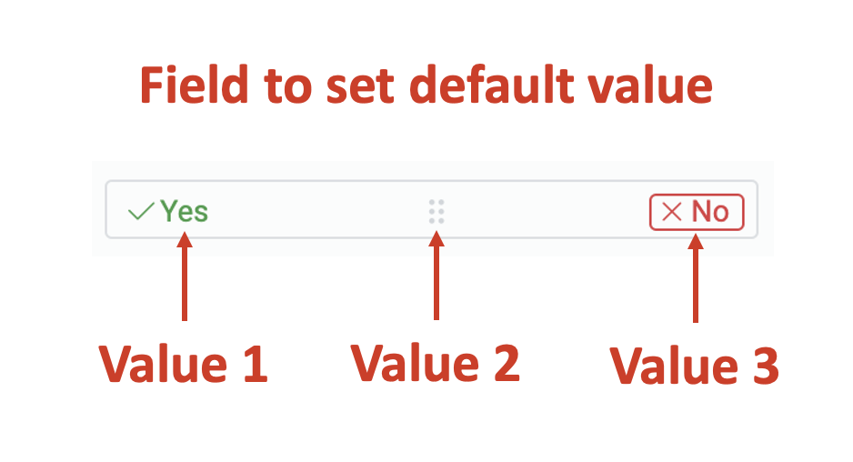
The element will mount with the default value on the Adaptive document.
Also note that Yes, Not sure and No are not the option labels here. The options text can be customised (discussed later in this article) as True / False, On / Off, Accept / Reject. You should consider the values appearing in the default field as Value 1, Value 2 and Value 3.
A default value may be useful when you feel most users will fill out the same value, however, you still want to give them a flexibility to change the value of the element. For example - you are seeking user's medical history and there is a question - "Do you have diabetes?" If you feel most users will answer it as "No", then you can set this as default value. However, the user has the flexibility to input "Yes", and change it from default value.
d. Force disable - If this field is clicked ON, then it will supersede all enable conditions and the element will always remain in disabled mode.
This is useful when you want to display a dynamic piece of information to the users. For example - Imagine that the user is filling out the medical history form. For legal and privacy reasons, patients must agree to share their medical history information with the healthcare institution. You would set consent to share medical history as "Yes". This would become an informative instruction that the medical history will be shared with other relevant entities.
e. Force hide - If this field is clicked ON, then it will supersede all show conditions and the element will always remain hidden from the user.
This feature can be used in advanced Adaptive Documents, where you need to pass a certain value, but do not want to show it to the user. For instance, assume that a patient has arrived to the Emergency ward of the hospital. The toggle button to capture whether the patient has arrived for OPD or Hospitalisation, should be set as Hospitalisation and may not be shown to the user. The element will remain hidden from the user, and hence the user would not be able to interact with the element.
f. Display as - This is a dropdown field and allows you to set the nature of the toggle input. The dropdown has three options:
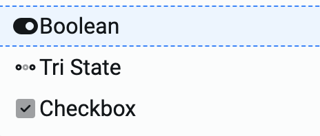
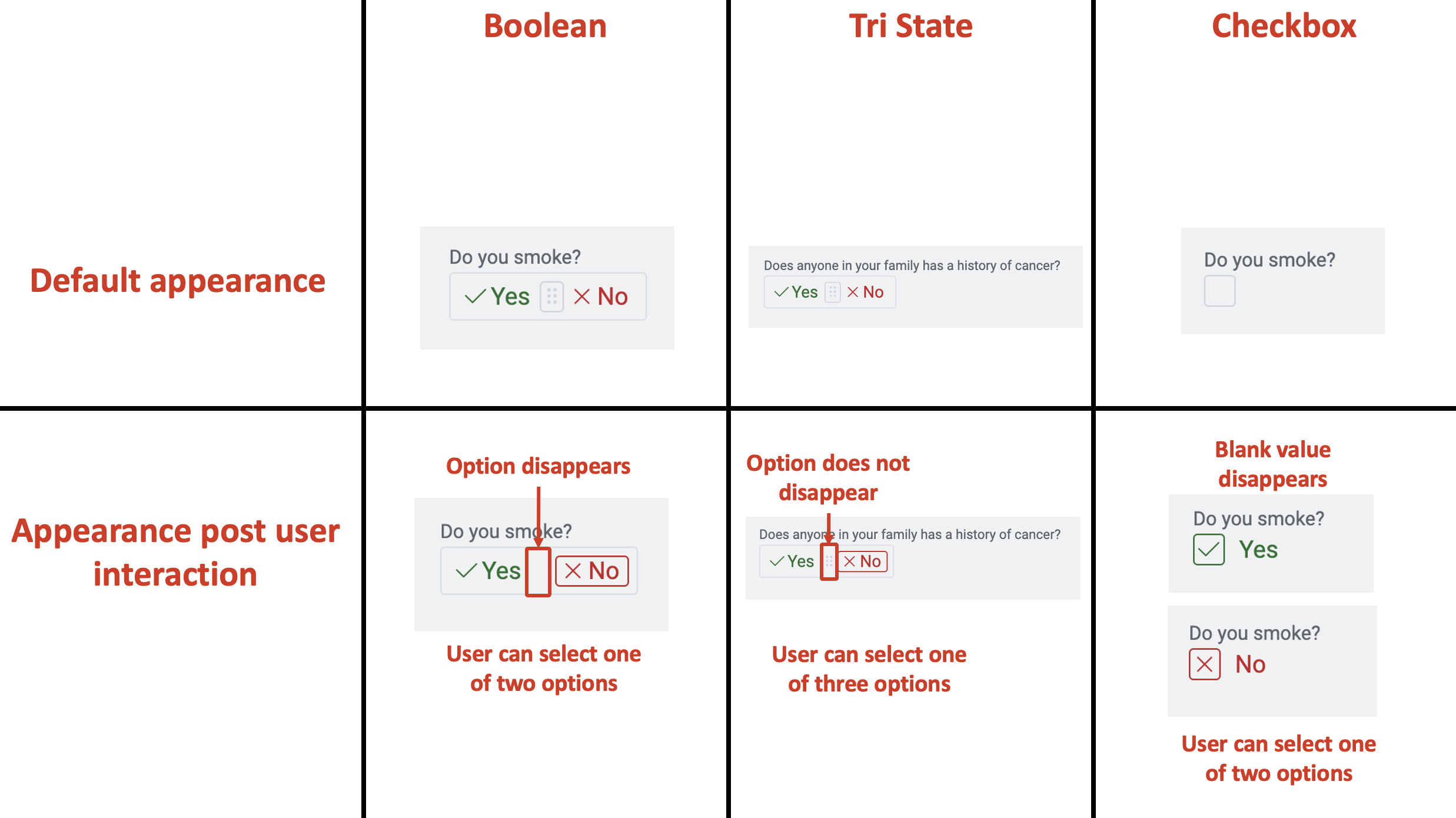
1. Boolean - This is the default display type for the toggle control. A boolean has three states - Yes, No and Not sure. While Not sure can be set as the default value, however, once the user has interacted with the element, it can either be a Yes or a No. The user cannot set the value as Not sure.
In other words, the boolean can have three values when loaded (if set in such a way in default field), but once user has clicked on the element, then the system will force the user to select one of two values only.
Hence, in Boolean type, the user has the flexibility to select one of two values.
For example - imagine a question - Do you smoke? When this question is loaded on the Adaptive document, it can show as the middle option, but once the user has clicked on it, the element will force the user to select either a "Yes" or "No".
2. Tri State - The appearance is similar to Boolean, but the only difference is that the user can select the middle value as Not Sure.
Hence, in Tri State type, the user has the flexibility to select one of three values.
For example - a question - Does anyone in your family has a history of cancer?
To this the user can select "Yes", "No" or "Not Sure".
3. Checkbox - As the name suggests, the appearance of this toggle type is different from that of Boolean type. This one appears like a Checkbox. However, just like Boolean type, the element may load with a blank (Not sure - third value), but once the user interacts with it, the system will force the user to select one of two values only.
The next three fields help define the option's appearance.
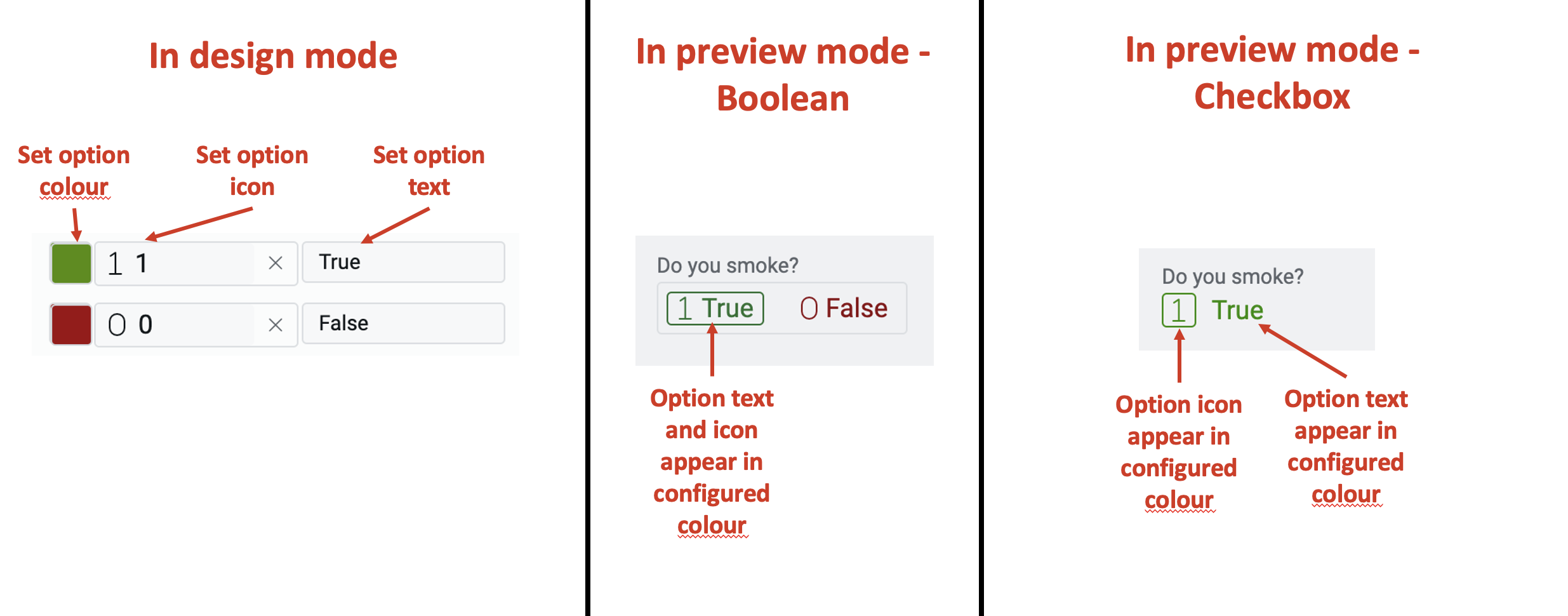
g. Set option colour
Click on this box to open colour setting panel.
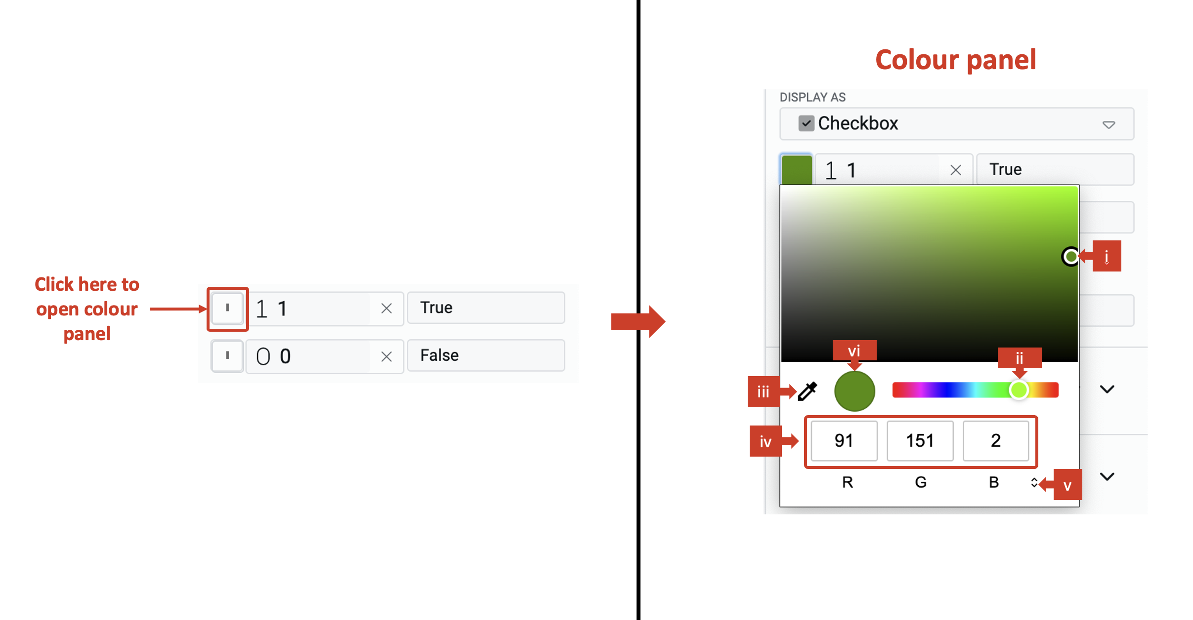
You will receive the following options to set colour for the option.
i. Drag the point on the color shade. ii. Drag the point to change the colour over the spectrum. iii. Click on the dropper to copy colour settings from other image point visible on the screen. iv. Set code for colour definition method (for example - set code for R, G and B). v. Change the colour definition method. There are three options available - RGB, HSL and Hex.
vi. The defined colour is visible in the circle.
Once you set the colour, the option icon and option text will appear in the set colour.
h. Set option icon
You can display an icon on the option. This icon appears next to the text in Boolean and Tri-State display types. This icon will appear inside the box for checkbox type. To set the option icon consider the following steps:
- Click on this field.
- The icon picker will open. The icon picker has a list of 1389 icons.
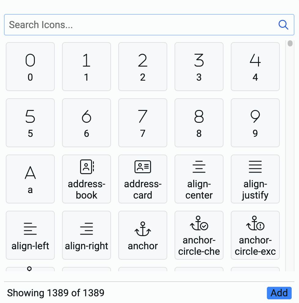
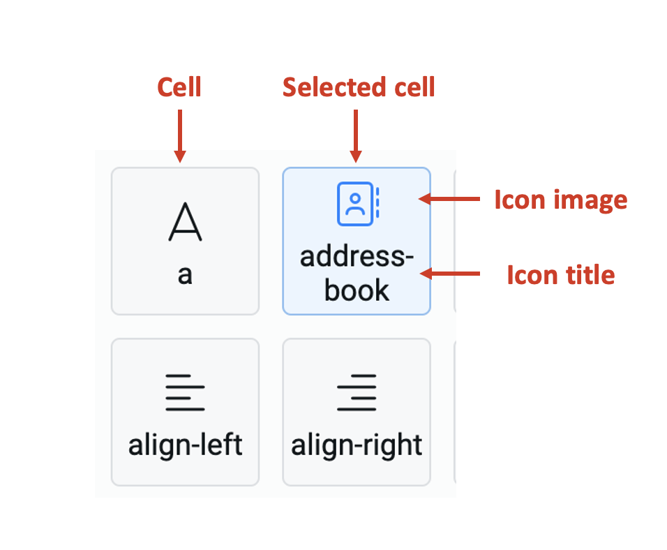
Each cell represents an icon with the icon image displayed on top and its title display below it.
-
You can search for the icon from the search icons bar. The system matches the typed keyword with the icon title and displays all the icon cells that match.
-
Select an icon by clicking on the cell. The selected cell is highlighted in blue. Please note, you can select one and only one cell.
-
Click Add at the bottom right corner of the icon picker.
i. Set option text - This field allows you to type in the option text. This customises the text of the option to suit the context of the toggle element. The default value for the two options text is "Yes" and "No".
j. Inline checkbox - When this field is clicked ON, then the toggle label and the options are displayed in the same line (instead of next line).

k. Class names - In this field, you can type the name of the CSS class and the element will be styled as per the CSS class definition.