Whole Number
What is a Whole Number input control?
A Whole number control allows the user of the Adaptive Document to enter an integer.
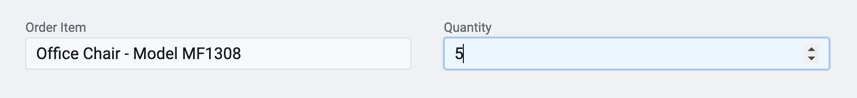
For example: Imagine you are creating an order details form which the users can use to fill in their requirements. You want to provide an input control where the users can fill in the quantity of a particular type of item.
Wherever there is a requirement for the user to input strictly an integer value, the Whole Number control can be used.
Whole number control is very similar to Number control. The fundamental difference being that Whole number control accepts integers, while number control can accept whole numbers along with decimals.
What are the attributes for Whole number?
Consider the following image and corresponding list, sequentially explaining the fields of the attributes section for Whole number control.
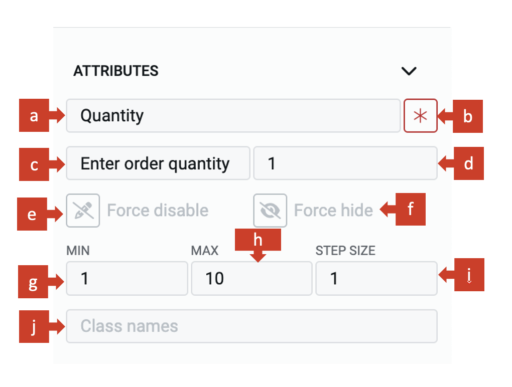
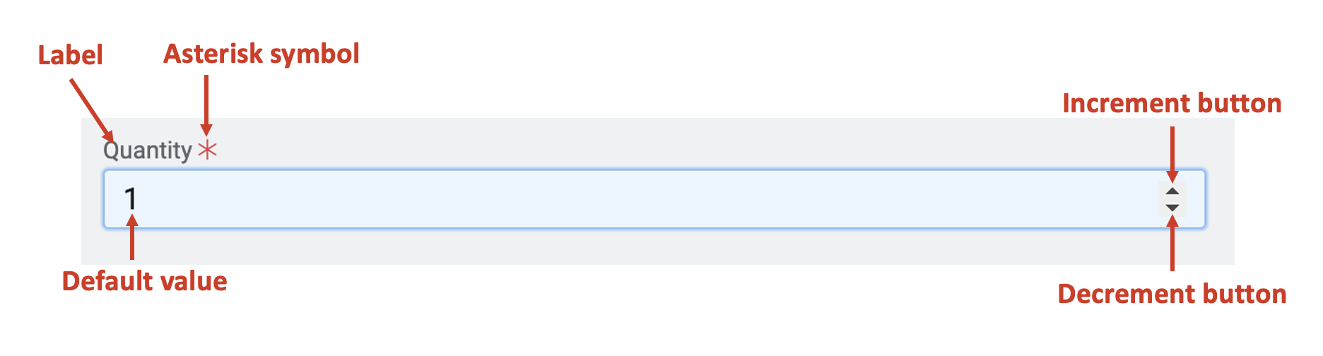
a. Label - This field allows you to type the label to the Whole number control. The label shall appear above the element in the Adaptive Document and is used to provide context for the user.
b. Asterisk (*) sign - If you click ON this field, then an asterisk sign will appear next to the label. This is used to indicate a special message to the users of the document. For example - conditions apply, the element is mandatory etc.
It is important to note that the Asterisk sign is only a visual indicator and does not imply any logical condition on the control. For example - turning the Asterisk sign as ON will not make the Whole number control a mandatory element for users. All logical behaviour for the control should be configured using conditions and validations.
c. Placeholder - The text entered in this field will appear in the Whole number element as ghosted text. You can use this Placeholder field to provide short instruction to the users, about the information they need to fill in the element.
The Placeholder text is only for display purposes. The text filled in the Placeholder field is visible to the user only till the time, the user has not selected the element for typing value OR the whole number does not have a default value (discussed next). If the user leaves the element blank, then the element will NOT have the Placeholder value and the blank value submitted for the element.
d. Default value - The number typed in this field becomes the default value for the element. If the user inputs a value to the element, then the default value will be replaced by the user entered value. If the user leaves the element blank, then the default value will be submitted as element value.
You can only set an integer value in the whole number default field.
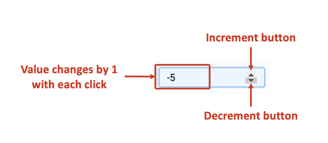
You can change the numbers using the increment / decrement buttons. Each click with change the number by +1 (increment button) or -1 (decrement button).
You can type in any positive value using the keyboard. However, to enter a negative value you will have to use the down-arrow (decrement) from 0 value.
A default value may be useful when you feel most users will fill out the same value, however, you still want to give them a flexibility to change the value of the element. For example - most people would order a single quantity of computer monitor, however, someone may want to order more monitors.
e. Force disable - If this field is clicked ON, then it will supersede all enable conditions and the element will always remain in disabled mode.
This is useful when you want to display a dynamic piece of information to the users. For example - An Invoice showing number of items ordered for each type. In such cases, while the item quantity number is a useful information, you do not want the users to change the same. Hence the element will display the value, but will remain disabled for user input.
f. Force hide - If this field is clicked ON, then it will supersede all show conditions and the element will always remain hidden from the user.
This feature can be used in advanced Adaptive Documents, where you need to pass a certain value, like the cost of the item, and do not want to show it to the user. The element will remain hidden from the user, and hence the user would not be able to see / enter any value to the element.
g. MIN - In this field, you can define the minimum value of input that the element can take from the user. For example - imagine there is a discount on an item, but it is required that the user should purchase at least 2 quantities of it. In such cases, you would want to set Min = 2.
h. MAX - In this field, you can define the maximum value of input that the element can take from the user. For example - imagine there is a promo offer on an item given by the retail store. The retail store wants to get access to as many different customers as possible using the promo scheme. Hence, the store does not want a single customer hoarding all the quantities of the item. In such a case, it would be beneficial to put a limit on the maximum value that can be entered in the element.
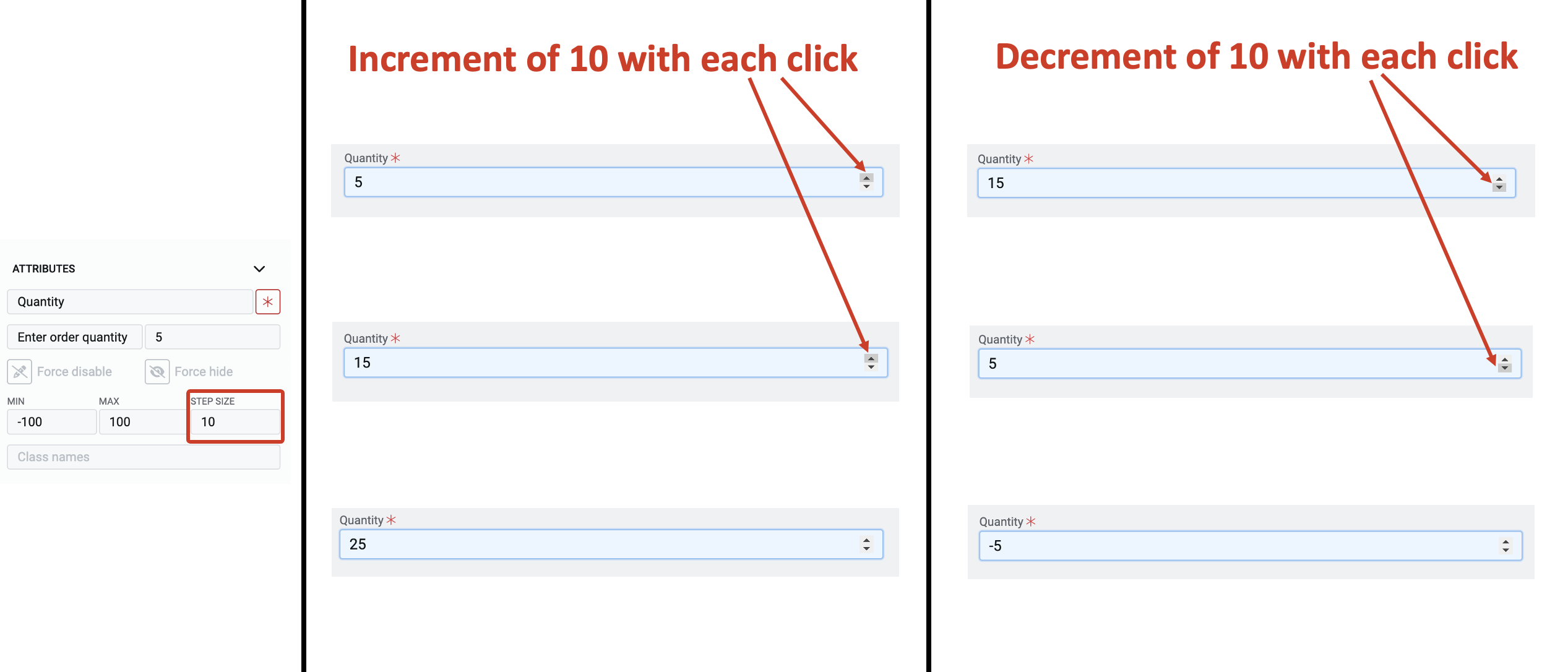
i. STEP SIZE - In this field, you can set the step-size which will define the change in the value of the element with each click of the increment / decrement button.
Assume that you have the value in the element as 5 and you have defined the Step-size as 10, then with each click of the increment button the value will increase by 10 ie. 15, 25, and so on.
Further, with each click on the decrement button, the value will be reduced by 10 ie. 25, 15 and so on.
You can increment and decrement values using the arrow keys of your keyboard as well.
j. Class names - In this field, you can type the name of the CSS class and the element will be styled as per the CSS class definition.