Element Picker
The element picker allows you to add elements to your Adaptive Document.
Controls vs Elements
Using the Element Picker, you can select control(s). These controls can then be configured as element(s) when they are added to your Adaptive Document.
Say you wanted to have the following two fields on the document:
- First Name
- Last Name
These would be two different elements on the Adaptive Document, but correspond to the same type of control (a Single Line where text can be entered). So from the Element Picker you will add the Single Line control twice, and then configure them as different elements.
Element Picker Layout
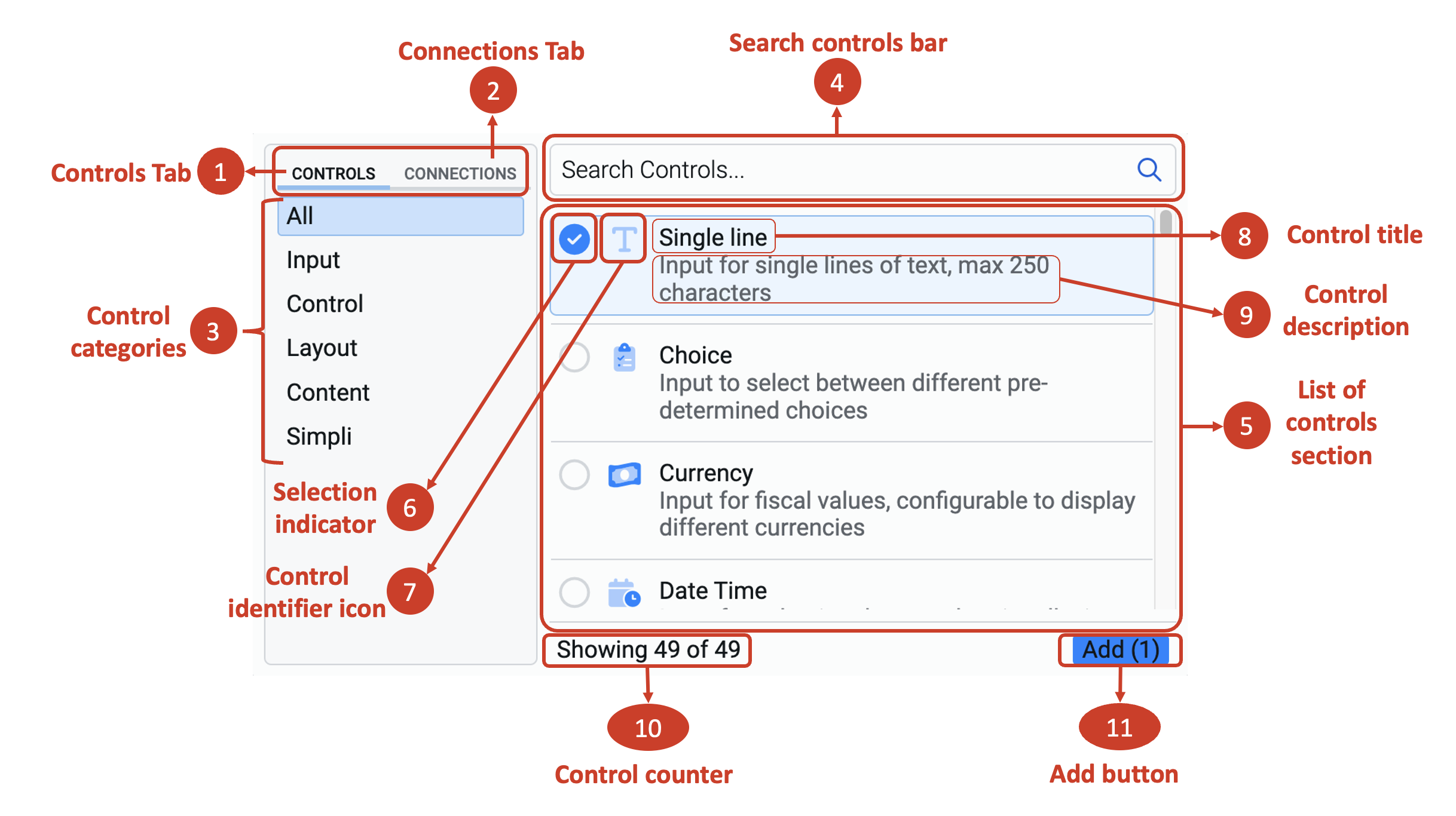
There are two tabs (labelled in the above as 1 and 2). Selecting each tab will display a set of control categories (labelled as 3).
1. Controls Tab
When this tab is active, you will see six categories of control, which are presented by default in any Adaptive Document. When the Controls Tab is active, then you will see six categories of controls:
a. All displays the list of all the controls and templates. Please note, it will also include controls from Connections.
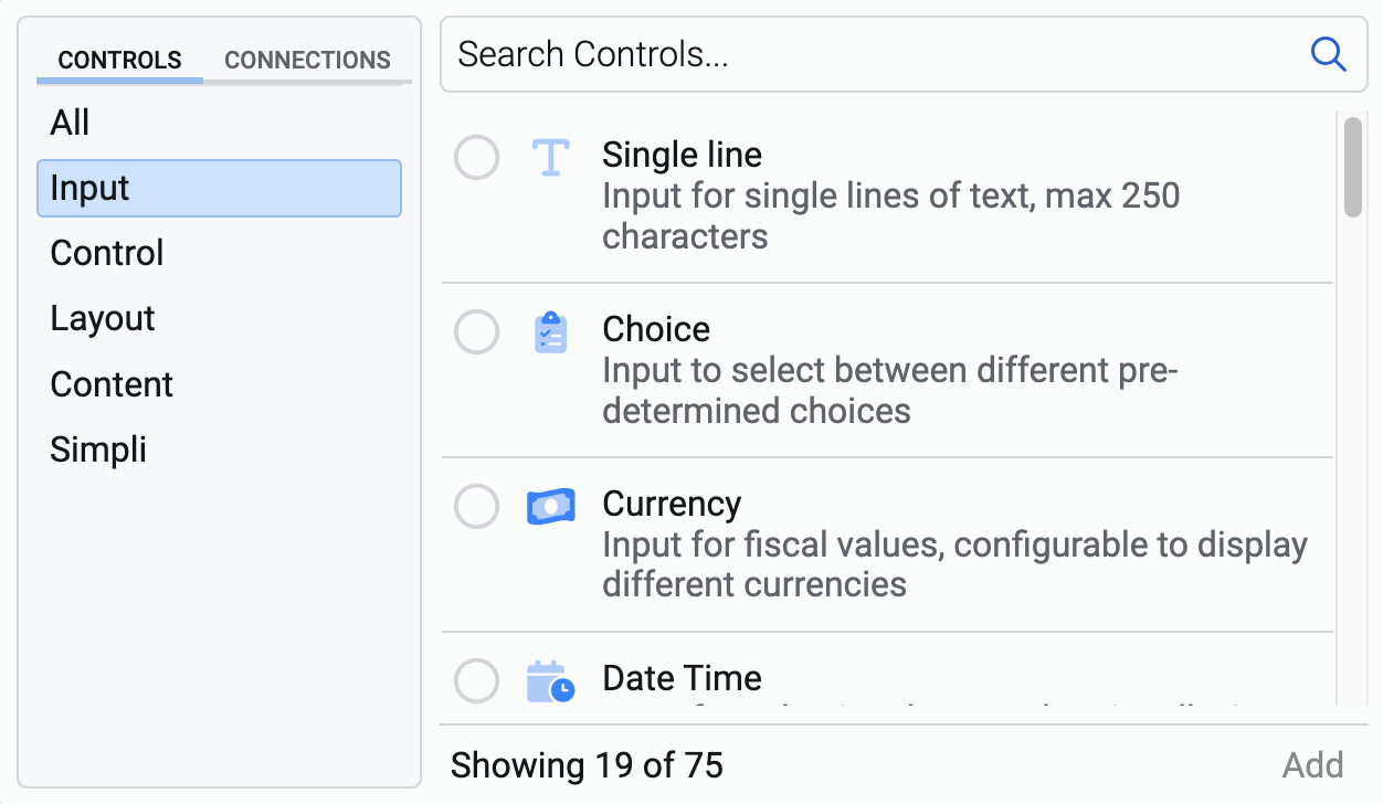
b. Input includes all the controls that accept input from a user. For example - Single line, Number etc. There are 19 controls in this category.
c. Control has two controls. They allow users to interact with the document in a defined manner. Buttons and Progress bar are the two controls in this category.
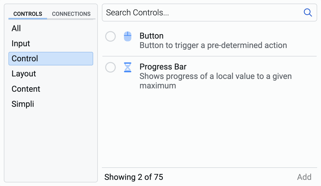
Do not confuse the title of this category with the control object, which can be configured as element. The title of this category is "Control" which derives its name from the interactive actions defined for the user.
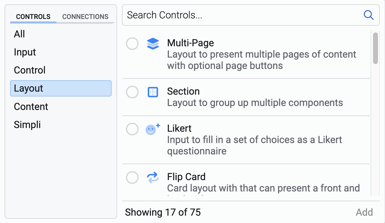
d. Layout includes controls that allow you to arrange and organise elements on the document. For example - Section, Accordion etc. There are 17 controls in this category.
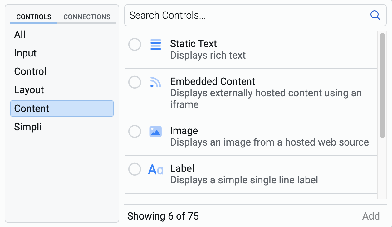
e. Content includes any control that displays information on the Adaptive Document. For example - Static Text, Image etc. This category has six controls.
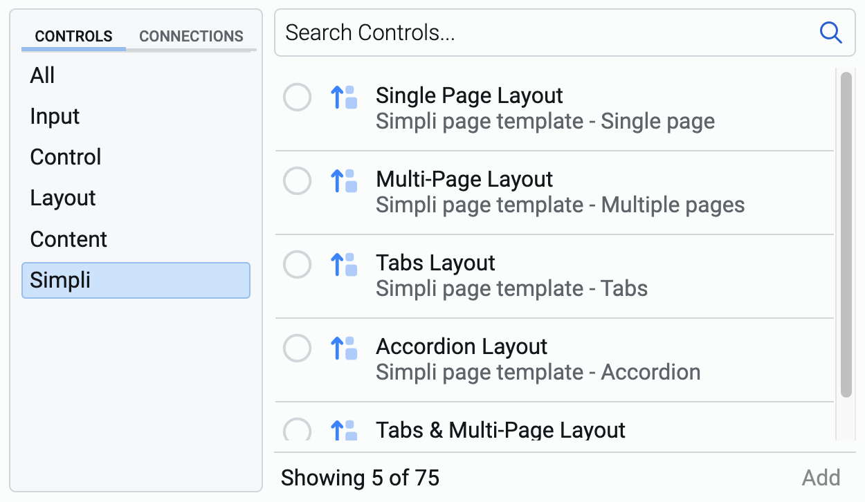
f. Simpli is a special category and does not contain any controls, as such. However, it contains templates available for quick design. You can select the template that matches with your needs and then add or delete controls on the composition area. This category has five layout templates.
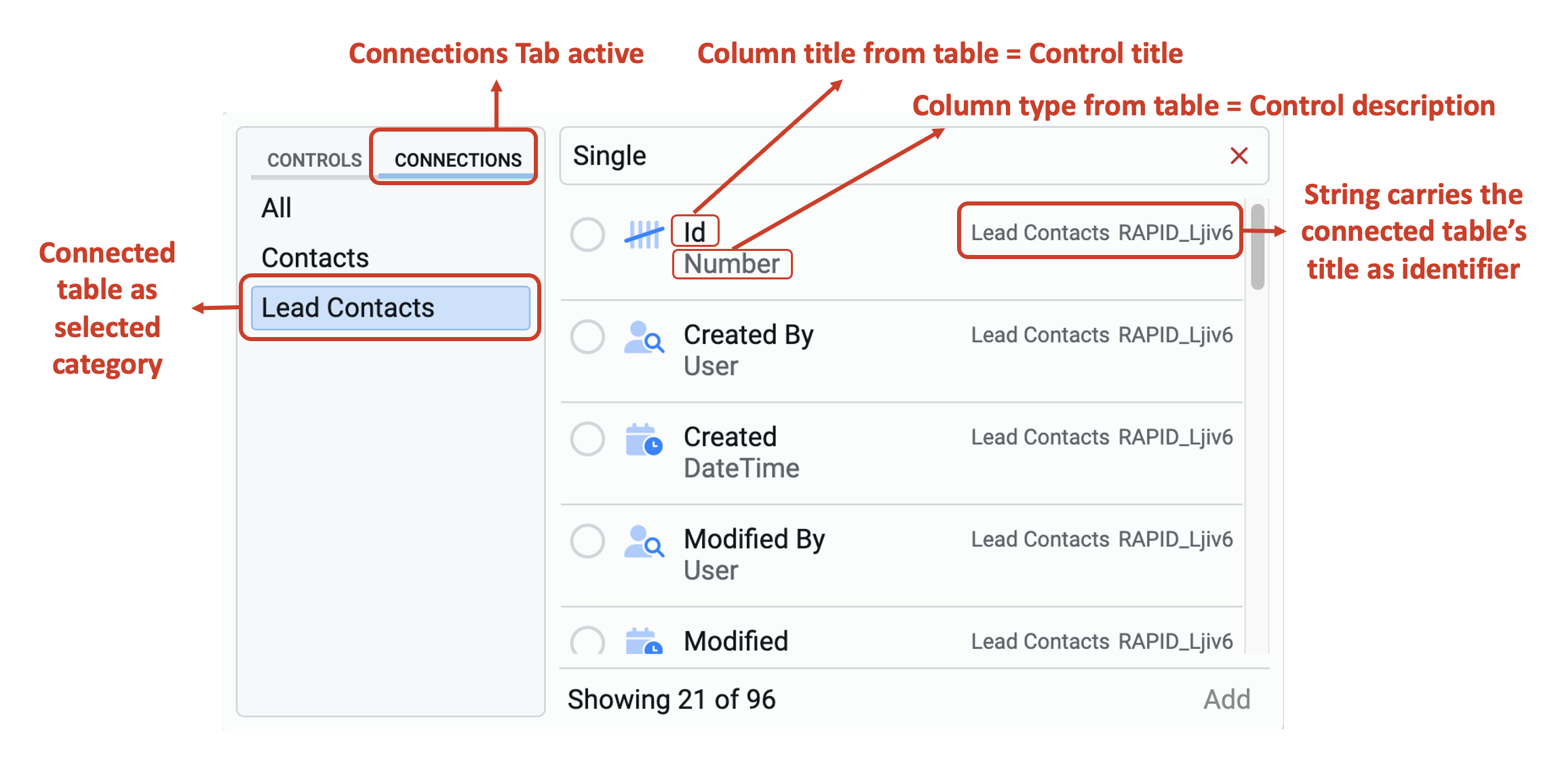
2. Connections Tab
This tab displays categories of control, which appear based on the connections to your Rapid database. When Connections Tab is active, the list of categories displayed are changed.
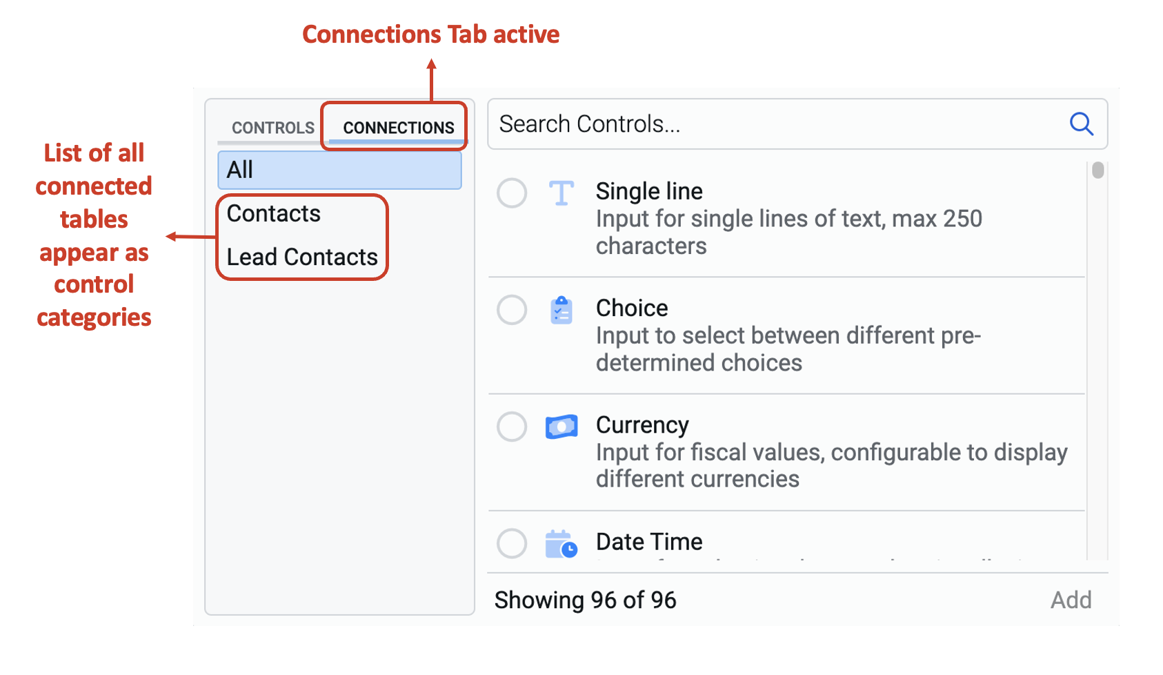
a. All does not change between Controls Tab and Connections Tab. It displays the list of all the controls and templates available across both the tabs.
b. List title displays all the list titles for which the connection has been successfully established with the document, or the connection name if it has been chosen.
In the example above, a connection has been made to the Contacts and Lead Contacts tables. Therefore, they are visible in the above image.
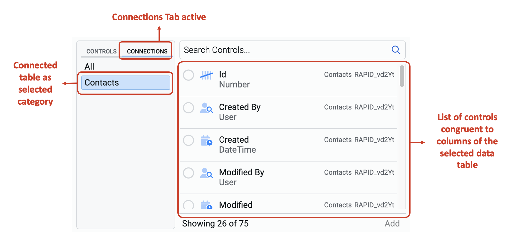
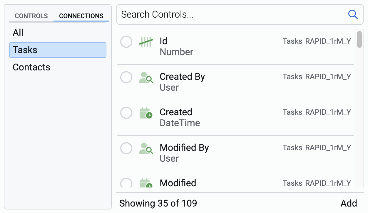
When you select a connections category, then it will show all the relevant controls as part of that list. If you select the data table Contacts, then all the columns of that table will be visible as controls.
4. Search bar
This search bar assists you in searching for the relevant control. The benefit of using the search bar is that you do not need to scroll through the list and manually search for the right control.
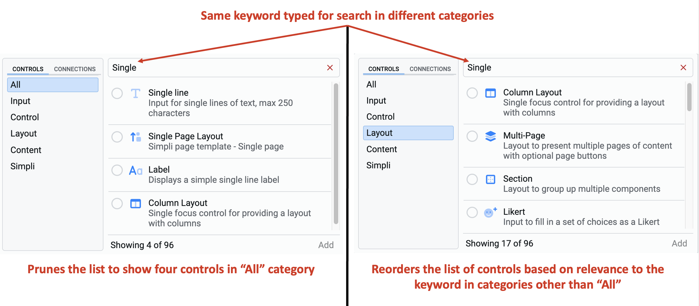
The search bar looks for the relevant controls in the selected category only.
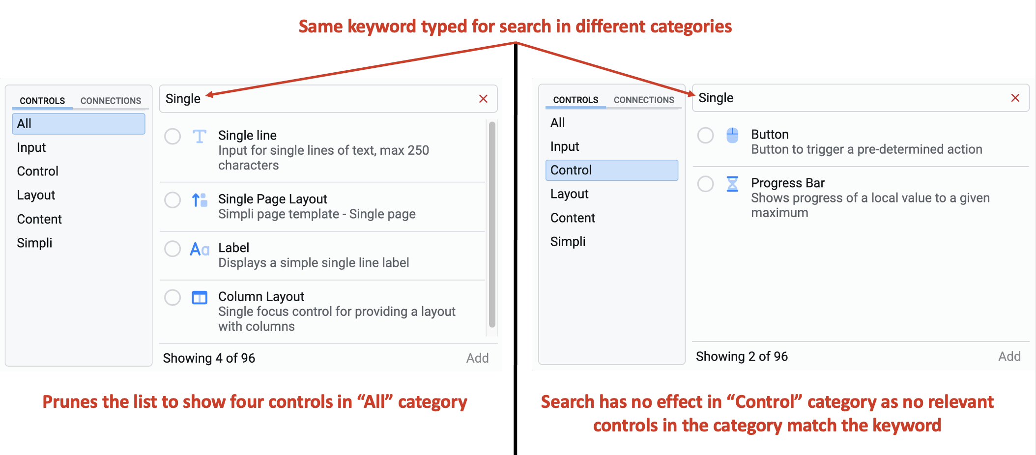
The search results are only pruned for the "All" category. For all the other categories, the search results are sorted in the order of relevance.
For example, in the below image, observe that for the search keyword "Single", the "All" category shows 4 controls, whereas "Layout" category shows 17 controls (which is the number of controls in the Layout category). However, the search results for the Layout category are sorted in the order of relevance with the keyword "Single".
5. List of controls
This is the section of the Element Picker where you see the list of all eligible controls (based on category selected / search keyword).
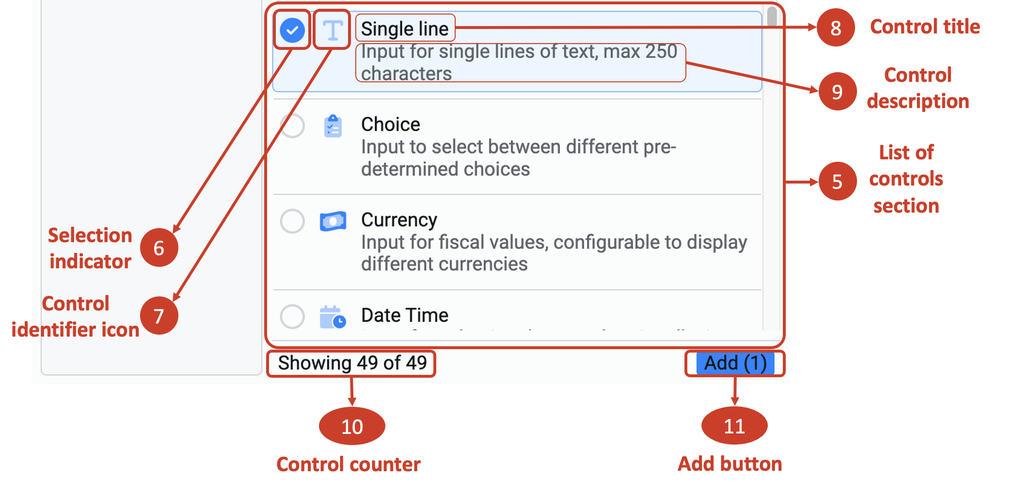
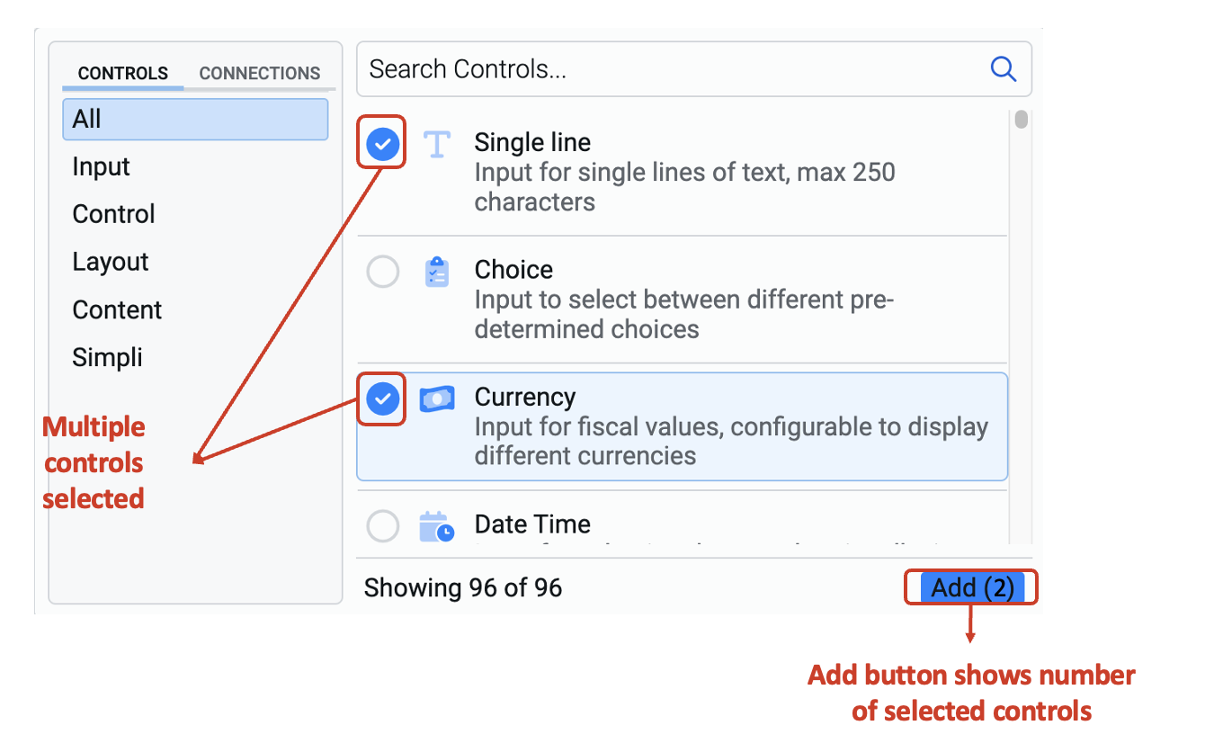
6. Selection indicator
This is the indicator that the subject control has been selected in the Element Picker and will be added to the Adaptive Document as an element (upon click of the Add button - labelled as 11).
When the control is selected, the selection indicator toggles on and the control gets highlighted in blue. You can click on the indicator again to deselect it.
7. Control identifier icon
Each control has a visual identifier icon. It is visible here, next to the Control title.
8. Control title
This is the title of the control. The title is of the highest relevance if you use it as a keyword in the search bar.
9. Control description
Each control has a description visible just below the Control title.
For a connection control (from a data table connection), the Control title is the column title from the data table. Control description is the column type. Additionally, you can see the connection string which helps you identify the data table to which the control belongs to.
10. Control counter
This is the counter which displays the number of controls displayed in the List of Controls section (see point 5 above) out of the total number of controls available. The counter has two parts:
- the number of controls displayed
- the total number of controls available for the document at that instant
11. Add button
This button adds the selected controls from the Element Picker to the Adaptive Document. The button is grey (disabled) when no control is selected. It turns blue when at least one control is selected.
The Add button also displays the number of controls selected.
Adding controls to the Adaptive Document
To add controls to the Adaptive Document:
-
Select the control(s) by clicking on them. (The selected control will be highlighted in blue).
-
Then press the Add button.
Please noteYou can select multiple unique controls from the Element Picker.
Repeating Sections
If the connection is set to View in the Connections Tab, then we are able to display multiple items using that connection. For example, in the image below, Tasks is a connection created with a View Method.
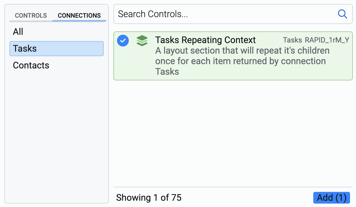
Please note the green highlight. This visually indicates the Repeating Context.
Adding a Repeating Context adds a layout section. However, it has a special feature that will cause the form to add multiple copies of this layout for each item sent to it from the connection array.

The added section appears with a green highlight, indicating it is a repeating section. You can add controls to the repeating section, just like any regular section, as discussed above. However, they appear in green colour.
When the form is displayed, users can add multiple items of data using the Add repeat button.
Imagine the user needs to enter the details for 10 employees using an Employee Registration form. For each employee the following need to be filled:
- Employee Id
- First name
- Last name
- Contact address
- Date of Joining
- Reporting manager
If the Adaptive Document does not use a repeating section, then the user will have to open the Registration Form and submit it ten times.
However, if the repeating section is used, the user will access the Adaptive Document once, can dynamically choose how many records of employees need to be entered (10 in our example), and submit the form only once.
Since the method of connection is View, the system can create multiple items.