Embedded Files
The Embedded Files component allows you to attach files to an item in Rapid so that they are more visible, and have additional functionality.
This component is no longer supported following Update 1.40.0
Please use the Attachments component to display files or attach them to items.
Viewing Embedded Files in a Table
While Embedded Files will appear as files in the default Files tab of an item's page, they are also visible when viewing an item in a Table.
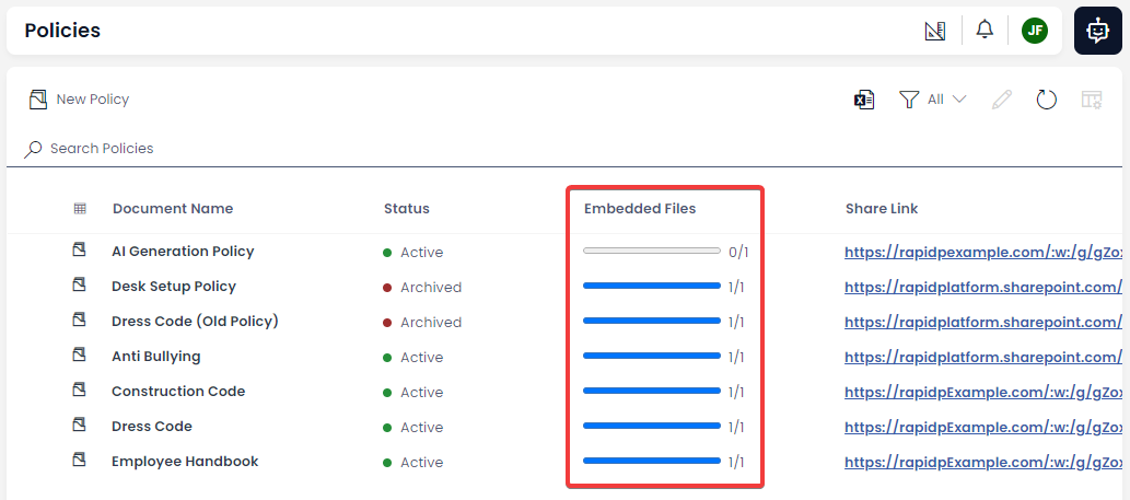
You can visit the Viewing Files Using Tables section to learn more about how Embedded Files are displayed in a Table.
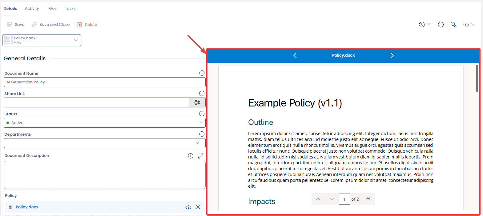
Viewing Embedded Files in the Files Preview Component
If an item's page is also configured with the File Preview Component, then a preview of the Embedded File will appear in the preview pane. This is will be most apparent when visiting the Files Tab when inspecting an item. You can learn more by visiting the Files Preview Component page.
The Page Component
The component can be configured to appear on the details page of an item. When configured this way, the page component will appear as follows:

Note the component has the following attributes:
| Attribute | Description |
|---|---|
| Label | If configured by your system administrator, an Embedded File component will provide a label for the expected file that will be uploaded into the component. In the example above, the expected file is a "Policy" document. |
| Attachment Area | This section allows you to click and open a file using your computer's file browser, or to drag-and-drop a file from your computer onto the field. |
When a Label is provided (e.g. "Policy"), then the document that is uploaded will be renamed. For example, the Word document titled Example.docx will be renamed Policy.docx automatically. If no Label is provided, then the document will not be renamed.
Uploading a File to the Page Component
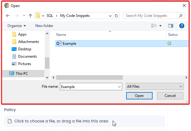
Clicking on the Attachment Area
If you click on the Attachment Area of the Embedded Files page component, your computer's file browser will open. You can navigate to the desired document, and then double-click on a file to upload it, or click the Open button on Windows, which will upload the document instead.
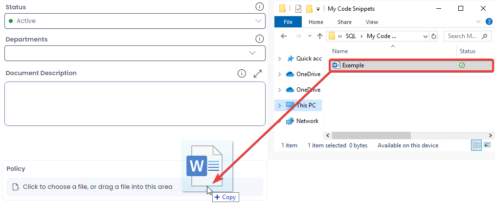
Dragging and Dropping from Your Computer
You can instead upload a file to the Embedded Files component by clicking and dragging a file from your computer's file browser, and then "dropping" it onto the component.
Uploaded File Appearance
When a file is uploaded to the Embedded Files component, the component's appearance will change.

Note the component will now have the following attributes and functionality:
| Attribute | Fuctionality | Screenshot |
|---|---|---|
| Icon | Rapid Platform will display the icons of common filetypes that are uploaded to the Embedded Files component. |  |
| File Name | This is the name of the embedded file. The name is rendered as a hyperlink, and clicking on the link will open the document in a new tab. |  |
| Download Button | This button allows you to download the embedded file to your computer. |  |
| Delete Button | This button allows you to delete the embedded file from the component, and from your site's Sharepoint. |  |
Overwriting Files
When the Embedded Files component is configured to only allow one file to be uploaded, uploading any additional files to a component will "overwrite" the file that is currently stored in the Embedded Files component. This means the original file will be deleted, and the new file will replace it.
However, if the Embedded Files component has Multi-Mode enabled, then multiple documents can be uploaded to the same component.
Files that will be renamed of overwritten will have the following message appear in the Embedded Files component, before you press Save. Note that you will need to save the item for the overwrite to take effect. The change can be undone by clicking the cancel X button on the far right of the alert.

The Tabstrip Component
Instead of adding the Embedded Files component to page layout of an item, it can instead be configured so that files appear in the tabstrip instead. Note that the tabstrip component is more compact than the page component. When the component is configured in this way, it will appear as shown below:

| Attribute | Description |
|---|---|
| Thumbnail | A small grey rectangle that is empty currently. When a document is uploaded, this thumbnail will show a file preview of images, or certain supported file types. |
| Label | If configured by your system administrator, an Embedded File component will provide a label for the expected file that will be uploaded into the component. In the example above, the expected file is a "Policy" document. |
| Attachment Area | The entire component area will allows to click and open a file using your computer's file browser, or to drag-and-drop a file from your computer onto the field. |
Uploaded File Appearance
When a file is uploaded to the Embedded Files component, the component's appearance will change.

Note the component now has a drop-down menu, which is indicated by the chevron ( V ) on the right side of the component. Clicking the chevron opens the drop-down menu. Note the following functionality is now available:

| Attribute | Fuctionality | Screenshot |
|---|---|---|
| Thumbail | Rapid Platform will display a preview thumbnail of common filetypes that are uploaded to the Embedded Files component. |  |
| File Name | This is the name of the embedded file. The name is rendered as a hyperlink, and clicking on the link will open the document in a new tab. |  |
| Open Containing Folder | This drop-down option allows you open your site's Sharepoint folder in a new tab, and see the file in its Sharepoint folder. |  |
| Download | This drop-down option allows you to download the embedded file to your computer. |  |
| Clear File | This drop-down option allows you to delete the embedded file from the component, and from your site's Sharepoint. |  |
Overwriting Files
When the Embedded Files component is configured to only allow one file to be uploaded, uploading any additional files to a component will "overwrite" the file that is currently stored in the Embedded Files component. This means the original file will be deleted, and the new file will replace it.
However, if the Embedded Files component has Multi-Mode enabled, then multiple documents can be uploaded to the same component.
Unlike the Embedded Files page component, the tabstrip component will not display a message when a file is being overwritten.
Multi-Mode Embedded Files
Note that the embedded files component can be configured by your system administrator so that multiple files can be attached simultaneously to the Embedded Files component.
The also enables you to download, view, or remove each file separately. Instead of overwriting files, when a new file is uploaded to an Embedded Files component with Multi-Mode enabled, the component will instead upload additional documents.
Additional File Components
Rapid Platform has several additional components that are useful for storing and manipulating files. Other useful components include: