File Browser
The File Browser component allows you to directly access the files stored in your Rapid site's Sharepoint folders. With the File Browser you can upload, download, delete, rename, open, or email the files stored in Sharepoint.
The File Browser component will be labelled <Item Name> Files to indicate which item's files are being accessed.
Viewing Files
Files as Items
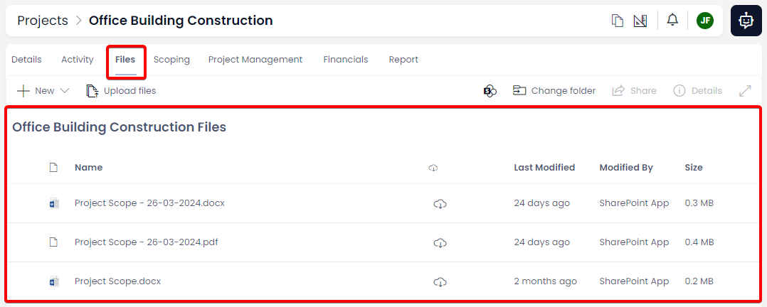
Using the File Browser component, we are able to view a variety of file attributes and information. If we examine the example file item below, the following information is visible:
| Column | Example | Explanation |
|---|---|---|
| Icon |  | Here the file's icon is displayed. In this example, a word document icon appears. |
| Name | Example Attachment.docx | Here the name of the file, and the file's extension are written out. |
| Download |  | Clicking this button will download the file to your computer. |
| Last Modified | 2 minutes ago | This is the (relative) time that the file was uploaded or last updated. |
| Modified by | Blurred out in this example for privacy reasons. | Here, the full name of the User or System that uploaded the file or edited it, will be displayed. |
| Size | 0.0MB | This is the size of the file in megabytes. The document in this example is very small (less than 1MB), so it appears as 0MB here. |
Selecting a Single File or Folder
To select a single file or folder, click anywhere on its row (except the download button).

Clicking on another item will cause the selection to switch to that file or folder instead.
Selecting Multiple Files or Folders
The File Browser component allows you to select multiple files or folders at once. This allows you to use a button from the Command Bar, and apply its commands to multiple items. Essentially, files in the Files Browser behave similarly to items in Explorer's Tables.
- Read about how to select multiple items in a Table
File Preview
When an item is selected using its selection circle, a preview of the file's contents will be generated in the File Preview if the file is a common filetype (e.g. .DOCX, .CSV, .PDF, .JPG, .PNG, etc.)
For this to happen, the File Preview must be enabled by your system administrator. The File Preview can also be revealed or hidden by using the Details button in the File Browser's Command Bar.
- Ensure an item is selected in the File Browser.
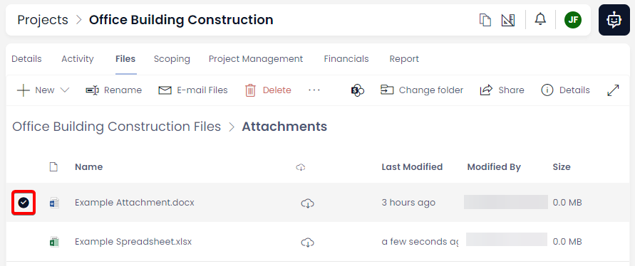
- Press the ⓘ Details button in the Command Bar.
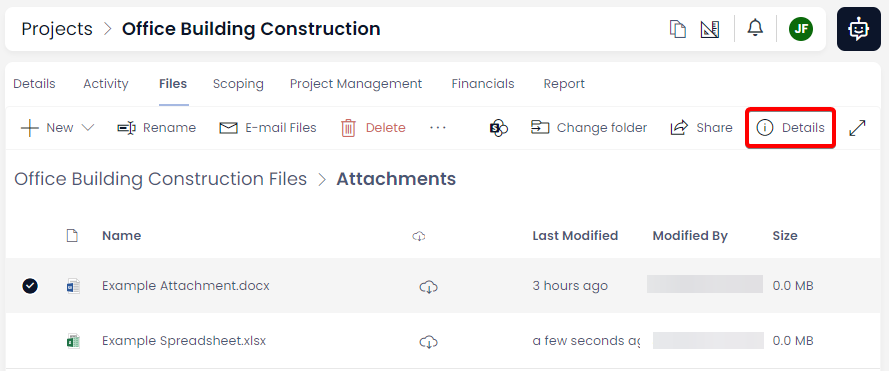
- If the File Preview is enabled, it will appear as a side panel on the right-hand side of the site.
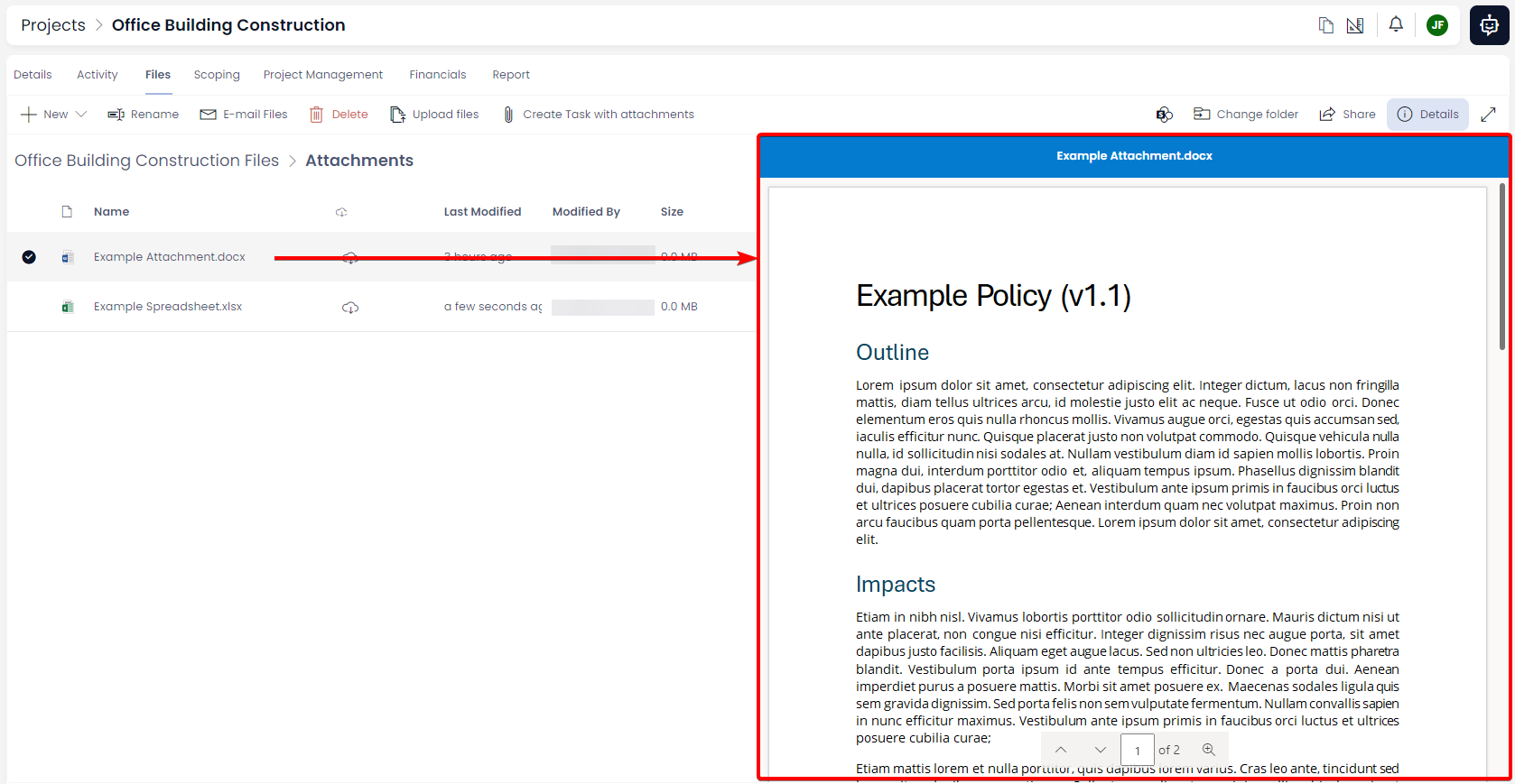
- If multiple items are selected, navigation arrows will appear at the top of the File Preview so that you can navigate between the files being previewed. In the centre of the arrows is displayed the name of the current document being previewed.

- Read more about how to use the File Preview Component.
File Preview Full-screen
On the right of the ⓘ Details button is the Full Screen* preview button. This button only functions when the File Preview sidebar is open.
Pressing this button will open the document in full screen for an easier reading experience. The Rapid site behind the document will become blurred.
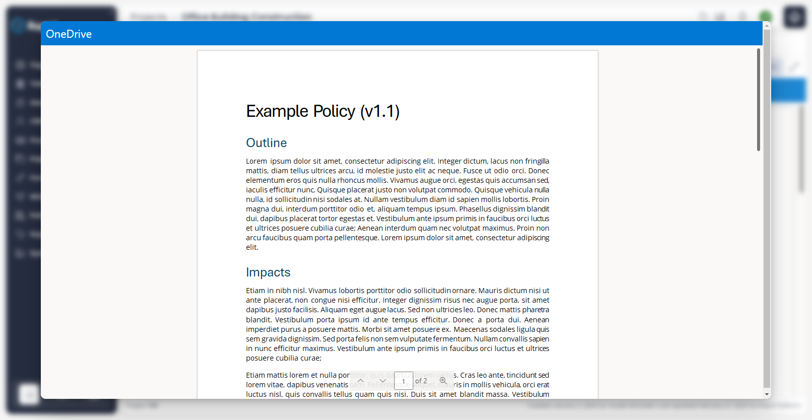
To return to the Rapid site, either click the blurred background of the site, or press the Esc key on your keyboard.
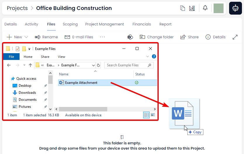
Upload Files via Drag-and-Drop
If the folder being viewed in the File Browser component is empty, the main display section of the component will display the following message:

As soon as a file is uploaded to the File Browser component, this message will appear. Note, however, that the functionality of dragging-and-dropping files will persist despite the message vanishing.
-
Find the relevant file in your operating system's file browser.
-
Click the file, hold the mouse, and drag it onto the display area of the component
-
Release the mouse when the cursor displays the message
+ Copy. -
The file will now upload.
In the next article, we will learn about the File Browser's Command Bar and its various functions, including an alternative method of file uploading.