Form
The Form Component is used to store the fields of an item on the item page. We often use forms in the physical world. For example, we need to fill out a form when we visit a dentist for the first time. We need to complete a form to start studying at an educational institution, or to complete our tax returns at the end of the financial year.
These physical forms are simply fields of data, just like in Rapid. When you submit a form to your dentist, you are really submitting a collection of fields (e.g. Name, Private Health Insurance, Date of Birth, etc.)
While we have briefly discussed how the data in an item can be edited, in this section we will go into detail about this process.
Appearance
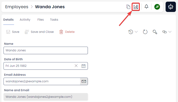
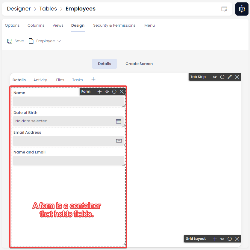
Forms are invisible when we view them in Explorer. However, we can see a form when viewing an item's page in Designer.
To view a form:
- The item will now open in the Designer application, where we can see how the item's page has been designed by the System Administrator. Here, we can see the form is box with a dashed border, where all of our fields are stored.
- To return to Explorer, we go back to where the Designer button was. It how now changed to the Explorer button, which is stylised as a browser with a magnifying glass. Clicking on this button will return us to Explorer.
You can read a detailed explanation of How to use Designer here.
Labels
Component Labels
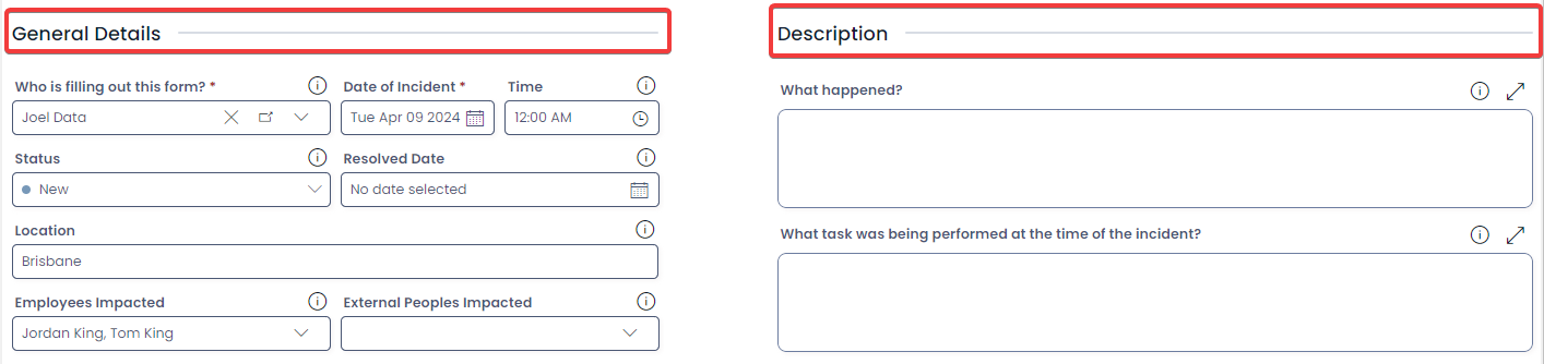
Component Labels are large pieces of text that act as headings on an item page. Component Labels allow us to understand sections of complex form. The example below is from a Rapid Standard item called "Incidents". Both the "General Details" and "Descriptions".
Component Labels will appear in large text, and also have a horizontal rule that helps break up content on a complex item page.
In Designer, labels are added to forms, just like a field. However, they can also be added as a separate page component outside of a form as well.
Field Labels
Fields can also be labelled. This is to show other text instead of the field or column title. The example below is a field titled "report_by_id", but this would not look aesthetic on a form. Instead, the System Administrator has placed the label "Who is filling out this form?" on the field instead. Now this text appears on the field instead.

Fields
The fields in a form display data uniquely, depending on the type of column they represent. The field functionality and how fields are displayed are explained in detail here:
Description Tooltips
If you System Administrator has created field descriptions, these will appear as an information icon ⓘ above the field. These explain the purpose of the field, in context.

To read a field's Description, hover your mouse cursor over the information icon.

Form Validation
Explorer has some simple form validation when editing or creating items.
Email Fields
Email fields must be formatted correctly (e.g. example@example.com). Omitting part of an email address will produce a validation message in red. The border of the field will also turn red to highlight the issue.

Email addresses which are incorrectly formatted can still be saved and submitted.
Required Fields
Explorer also has validation for required fields. A required field will appear with a red asterisk after the field's name. In the example below, the Date of Birth field has been set to Required. If no data is entered, this field will display the message stating "This field is required" and the border of the field will turn red.

Note: Explorer will not allow you to create a new item, unless all required fields have been filled. However, Explorer will allow you to save an item after a required field has had its data deleted.
User Fields and Lookup Fields
User Fields and Lookup Fields behave similarly. These are special fields that link to another item in the site.
- The Lookup Field allows you to select an item from a Table that has been determined by your System Administrator.
- The User Field is similar to the Lookup Field, except that it will only allow you to link an item to a User of your Rapid site. The User Table is a System Table that is built into every Rapid site.
Functionality
Below is an example of a User Field, followed by a table describing its functionality.
A User Field Without Data

A User Field With Data
| Attribute | Description | Screenshot |
|---|---|---|
| Display Field | In this example, the title of the item that is being linked to appears in the User or Lookup Field. Your System Administrator could also choose another column to display here, such as a subquery, computed field, etc. Clicking on this section will open the drop-down panel. |  |
| Remove Value | This is a button with an icon of an X. Clicking this button will delete the link between this item, and the item inside the Display Field. Note that this button will be greyed out, and cannot be used when no data is present in the Display Field. |  |
| Open Item | This button will navigate you away from the current item, and open the item that is being linked to. |  |
| Chevron | This icon indicates that the User Fields and Multi-lookup Fields will open a drop-down panel. Clicking on this button will open the drop-down panel. |  |
| Drop-down Panel | When a User Field or Lookup Field is pressed, it will open a drop-down panel where a connection to another item can be selected. If a User or Item is already selected, then selecting a new User or Item will replace it. | 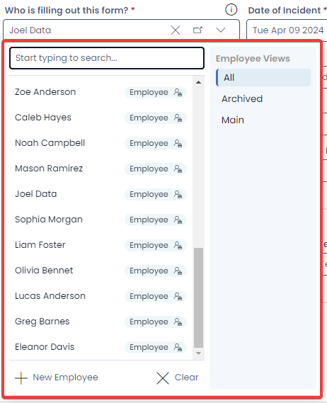 |
| Search Bar | This allows you to quickly search a Table for a specific item. Typing a User's name here, for example, would return a specific user. | 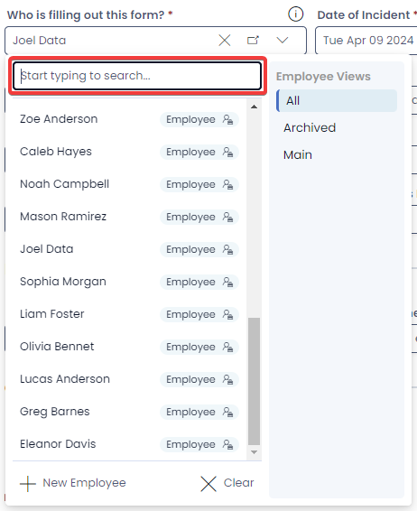 |
| Items List | This is where you choose the specific User or Item that you want to link to this field to link. On the right-hand side of each item is the name of the table that contains the item. | 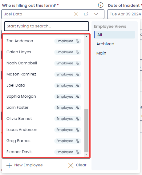 |
| Views Panel | Here you can filter the items being displayed in the Items List to find a specific item or user more quickly. These views are created at the Table level. | 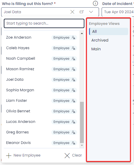 |
| New Item Button | This button will open the Create Screen panel, so that new item can be created. This item can then be linked to using the User Field or Lookup Field. | 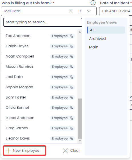 |
| Clear Item Button | This operates identically to the Remove Value button in the Display Field. Pressing this button will remove the data in the User Field or Lookup Field. | 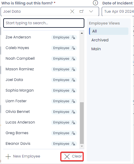 |
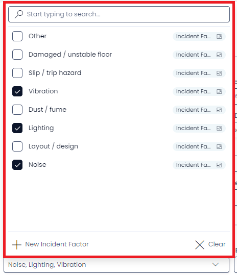
Multi-lookup Fields
Forms can also contain Multi-lookup Fields which share many similarities to Lookup Fields. A Multi-lookup Field, however, can link to multiple items, rather than just a single item.
A Multi-lookup field does not have the Remove Values or Open Item buttons in its Display Field. Instead, a Multi-lookup only contains a comma-separated list of items it links to, as well as the chevron.

When you click on a multi-lookup's field, a similar selection panel will open. Unlike a Lookup Field, however, you cannot open items using this panel.
The multi-lookup does allow new items to be created from the selection panel if desires, and also allows all items to be cleared with the Clear button.
By clicking the checkboxes beside each item, we are able to link or unlink multiple items using the component. The selected items appear as a comma-separated list in the Display Field.